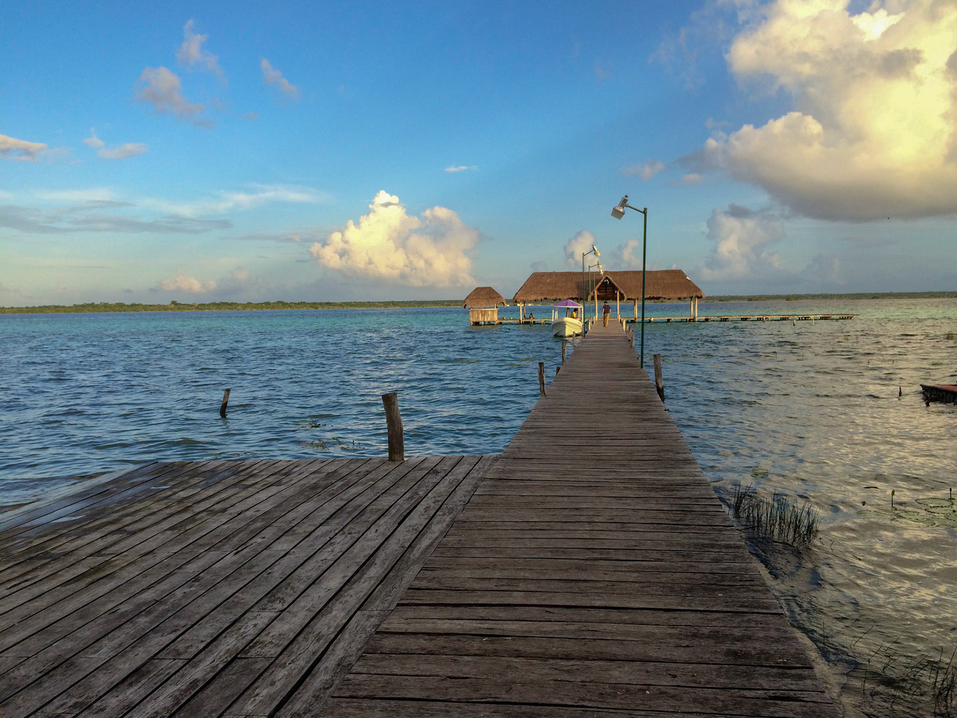
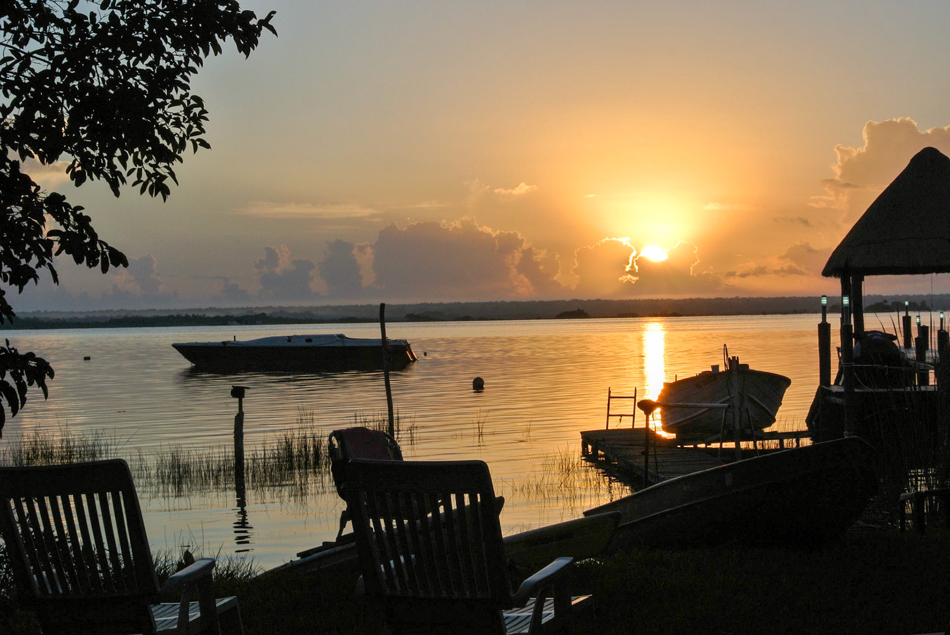
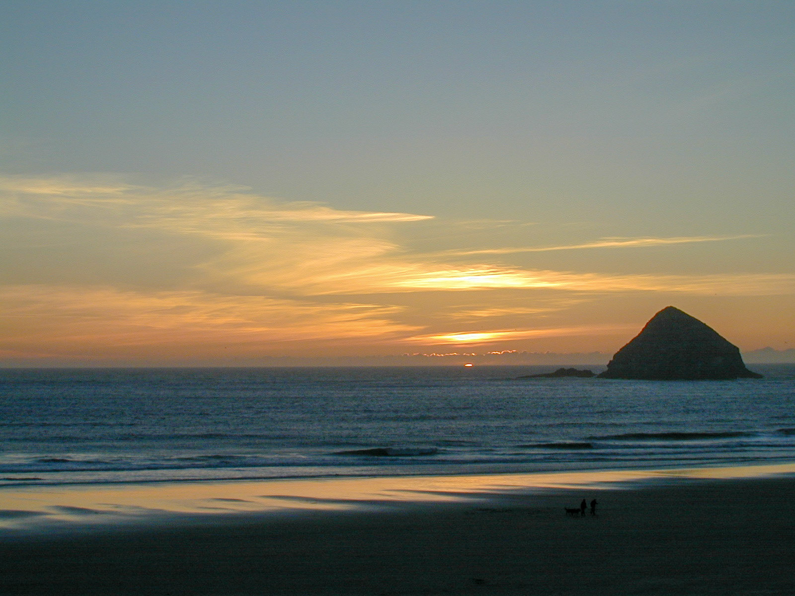
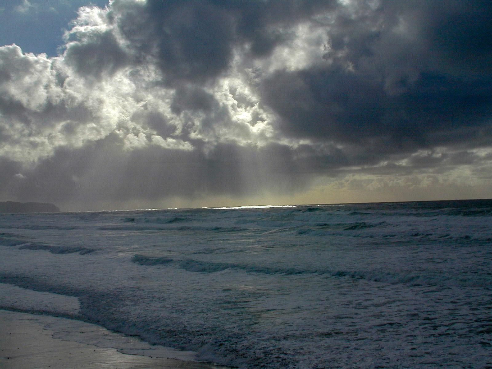
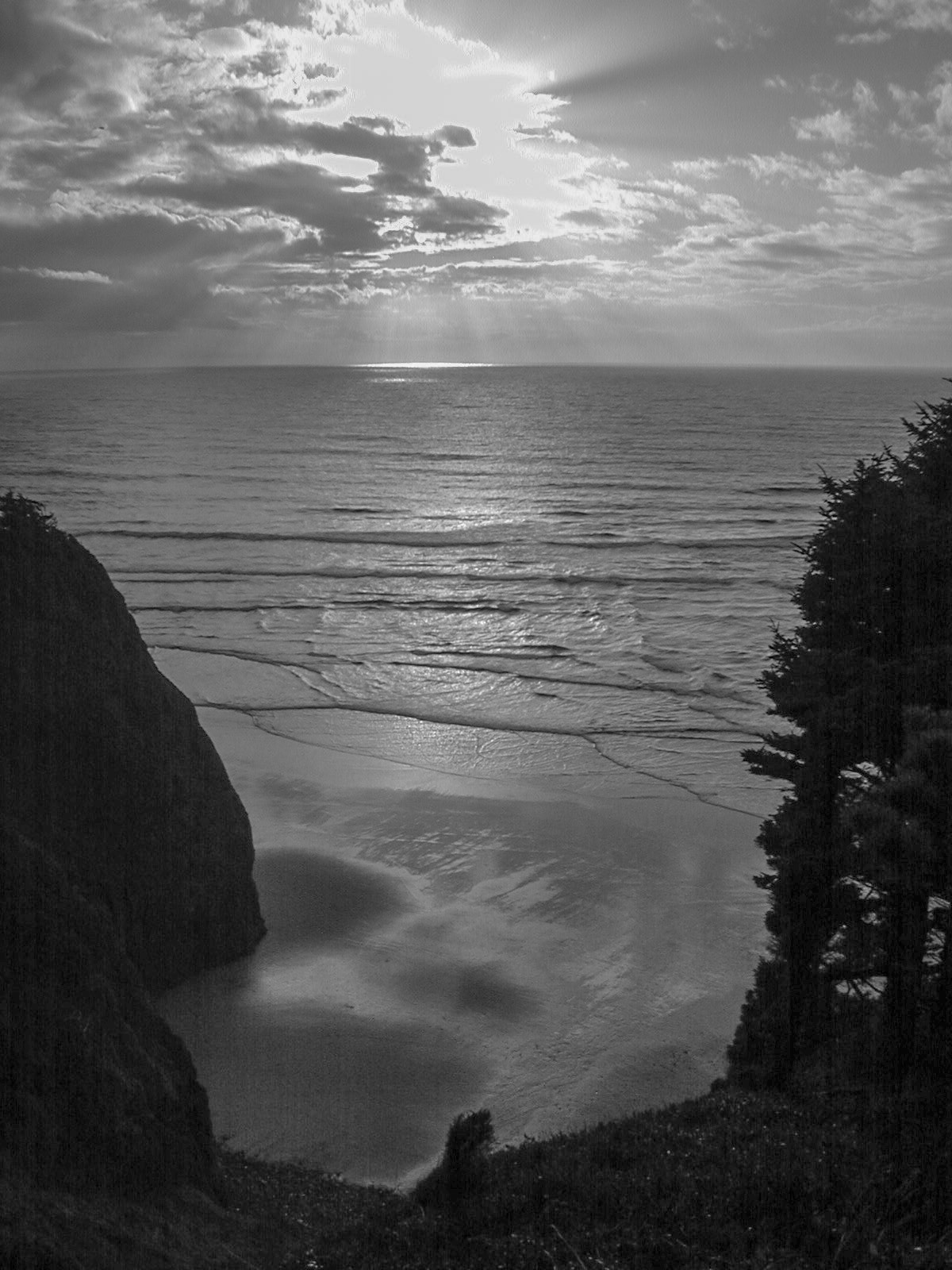
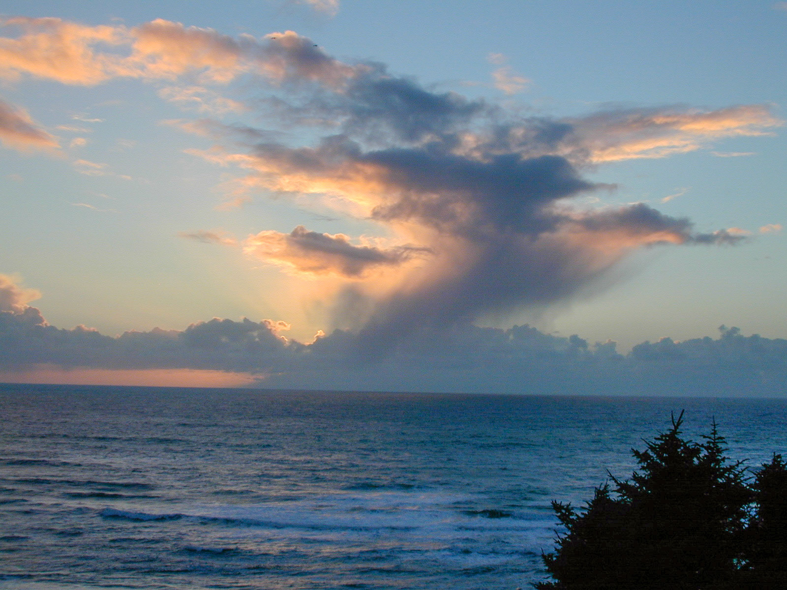
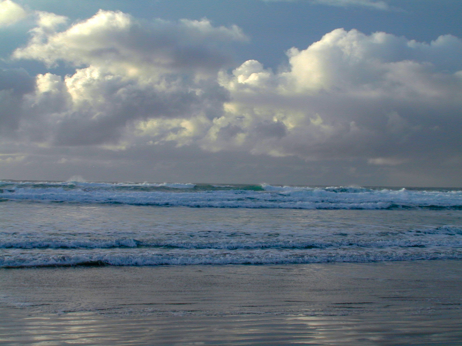
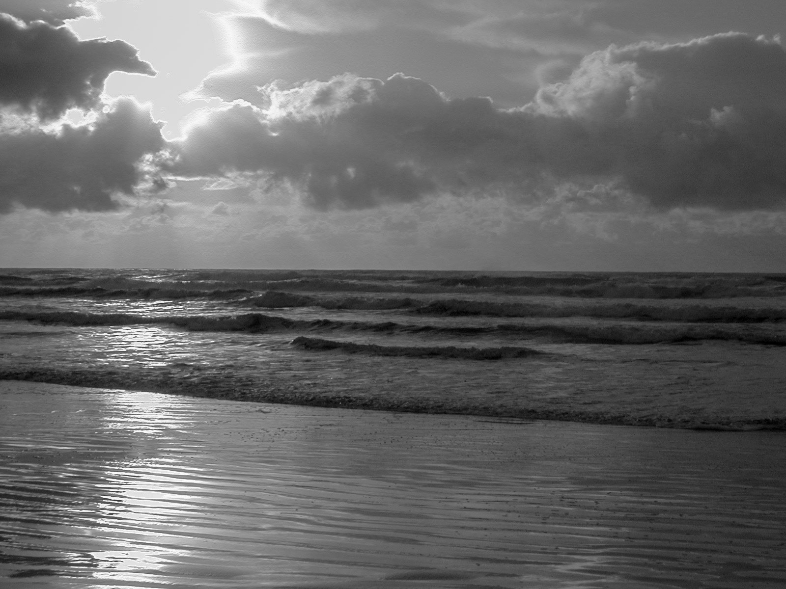
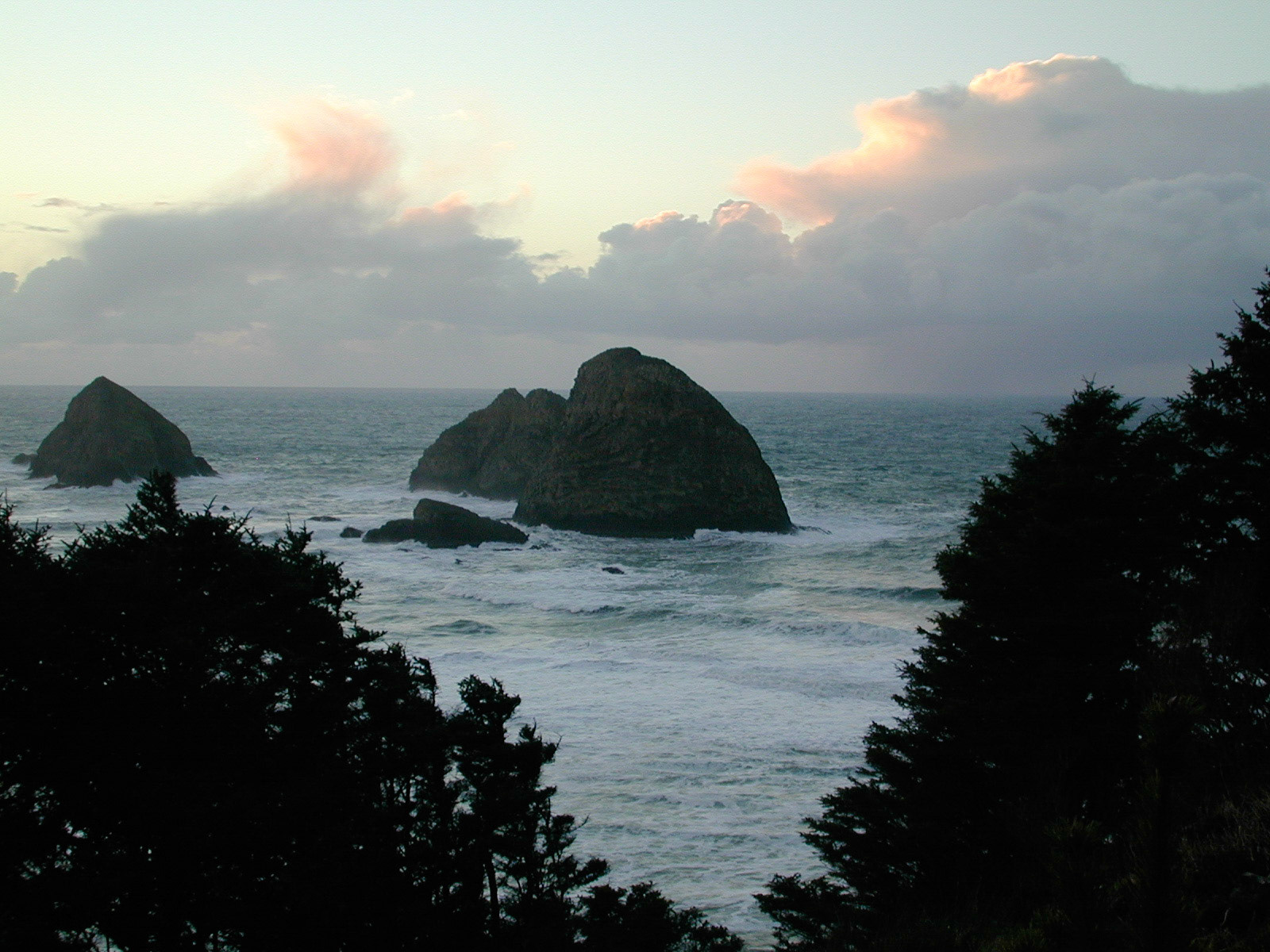
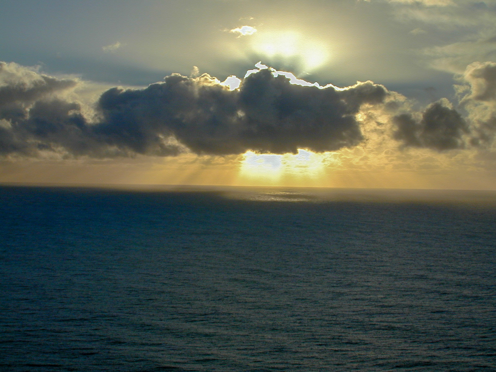
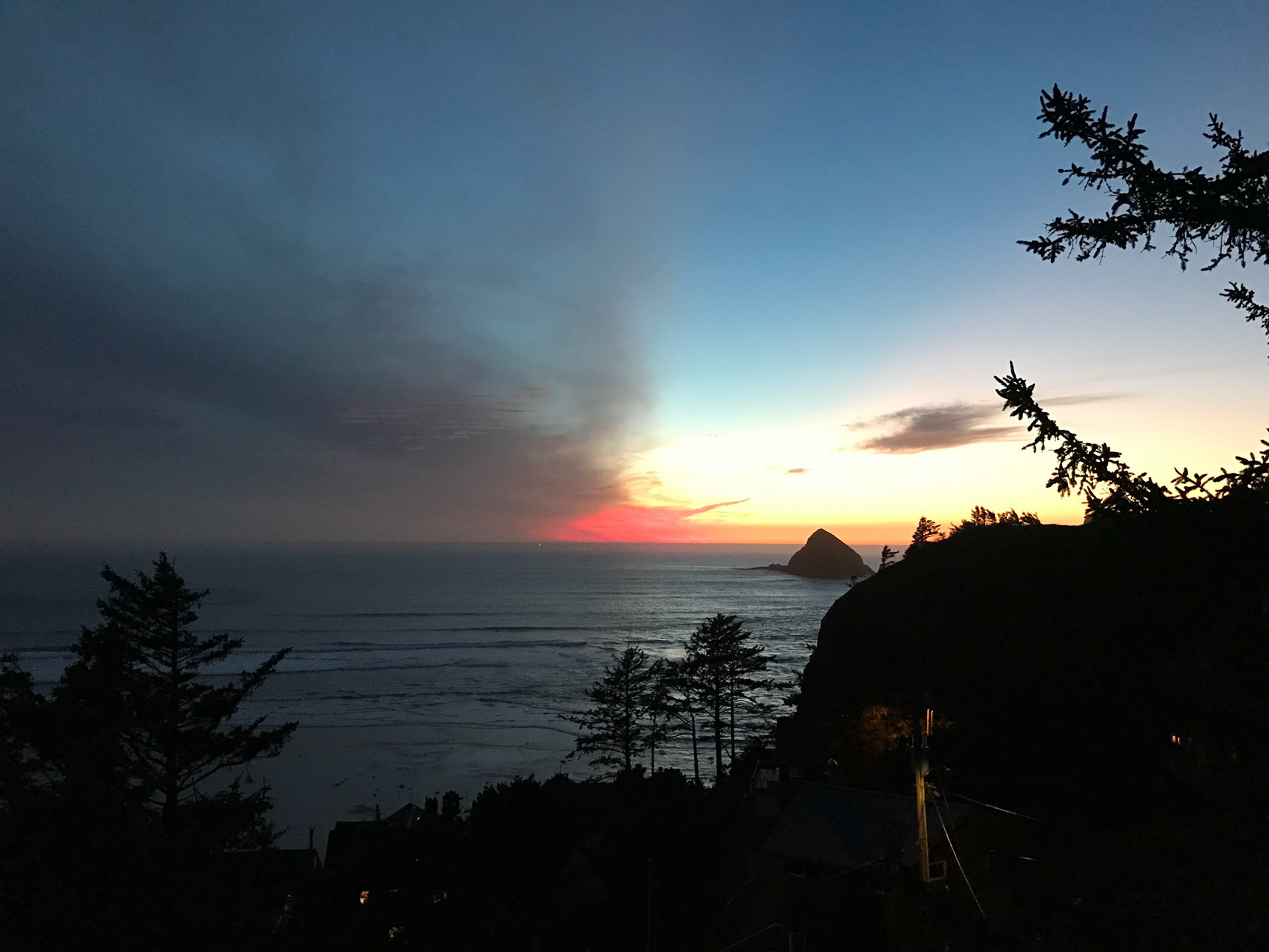
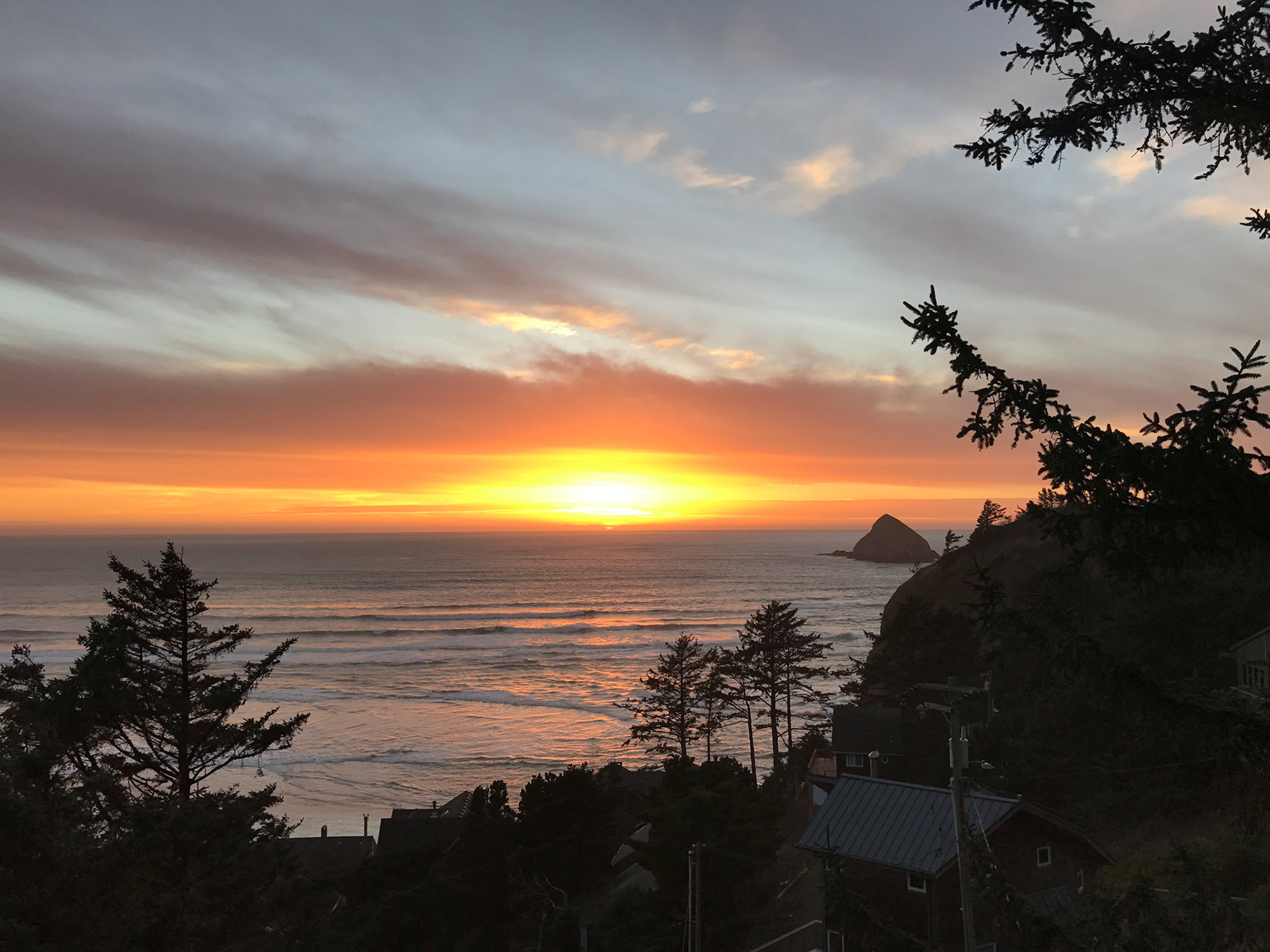
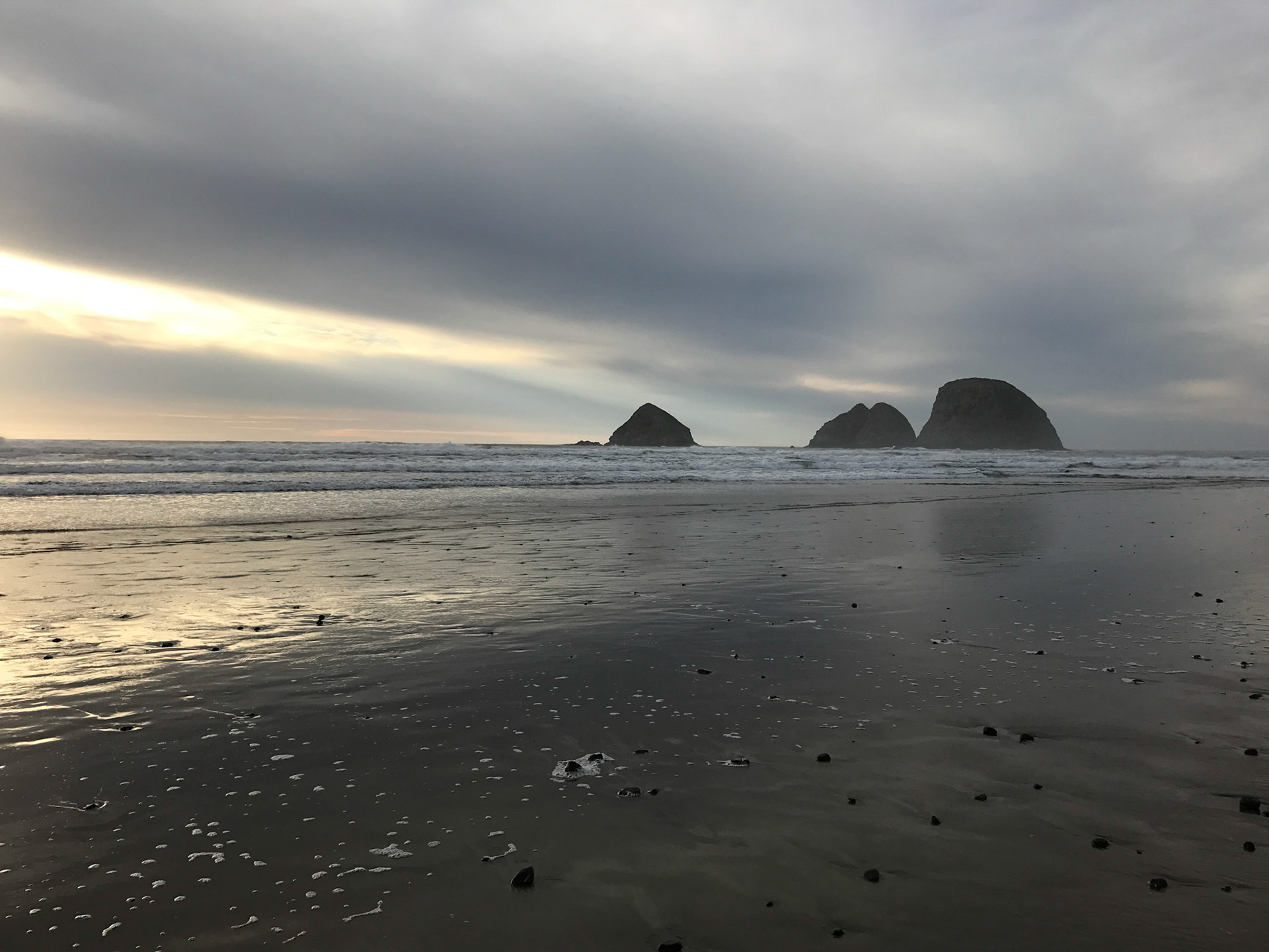
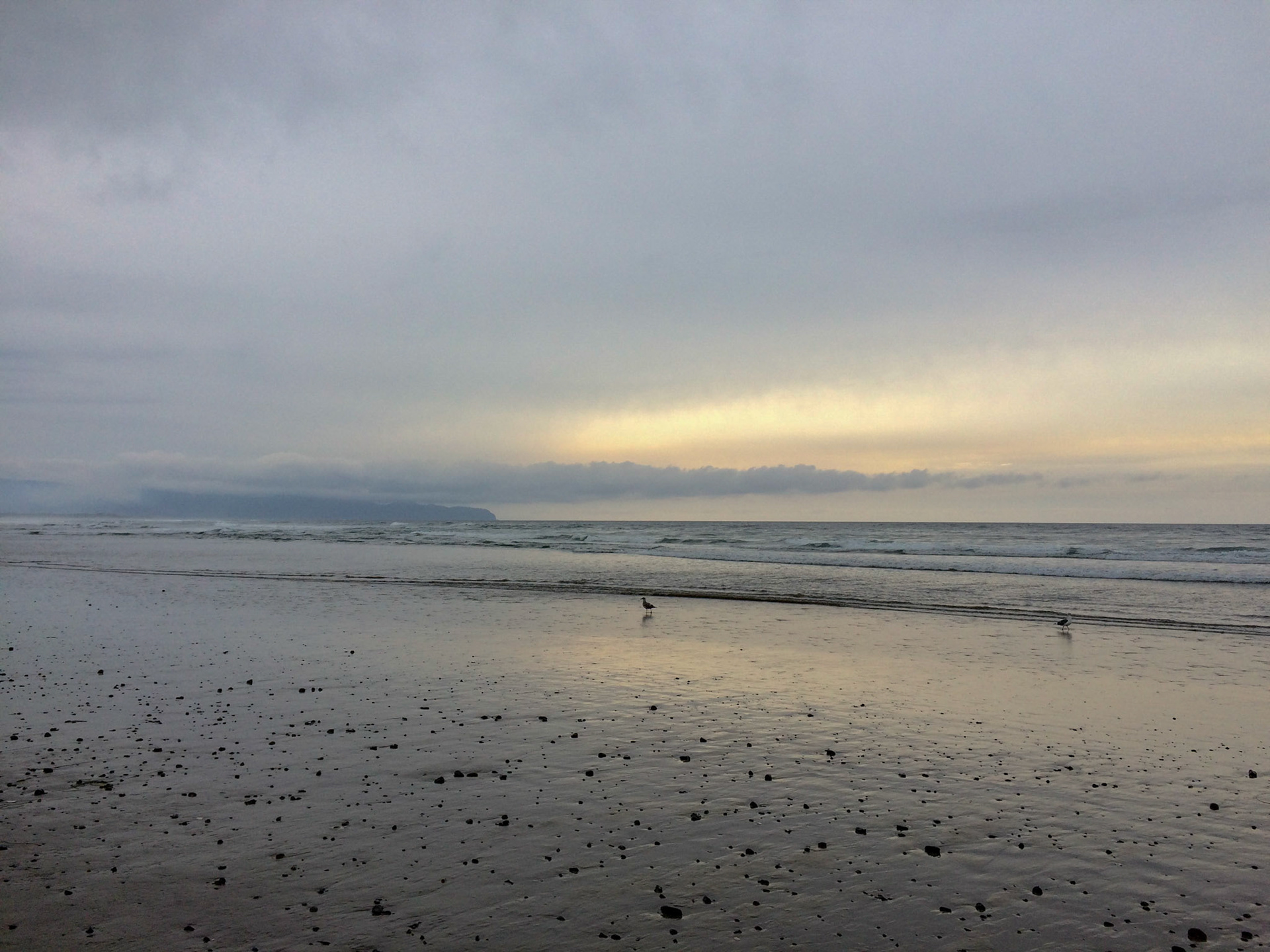
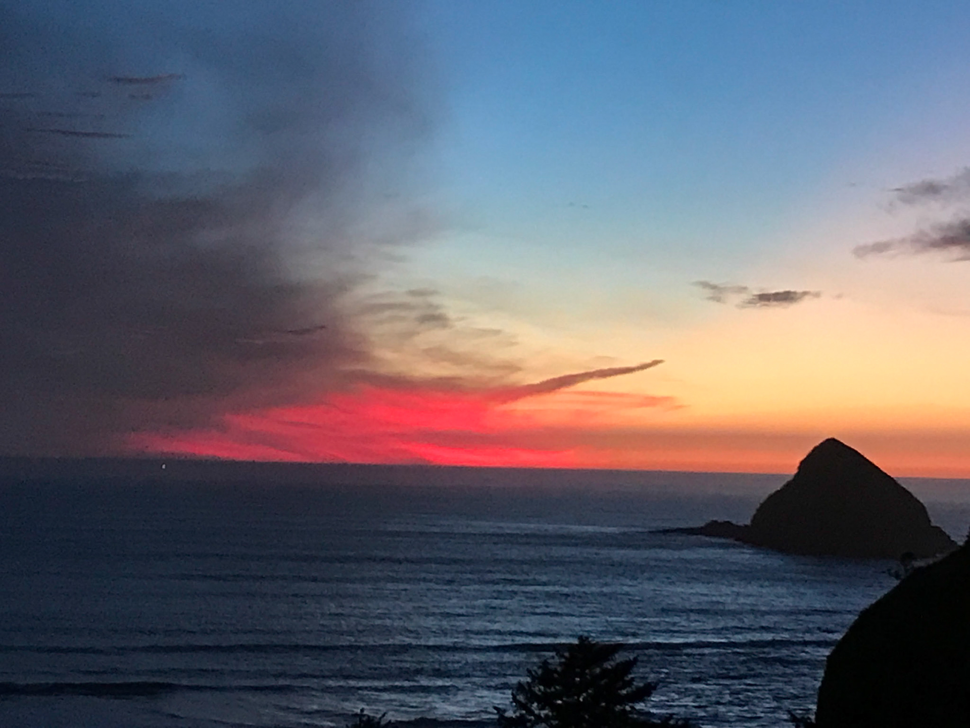
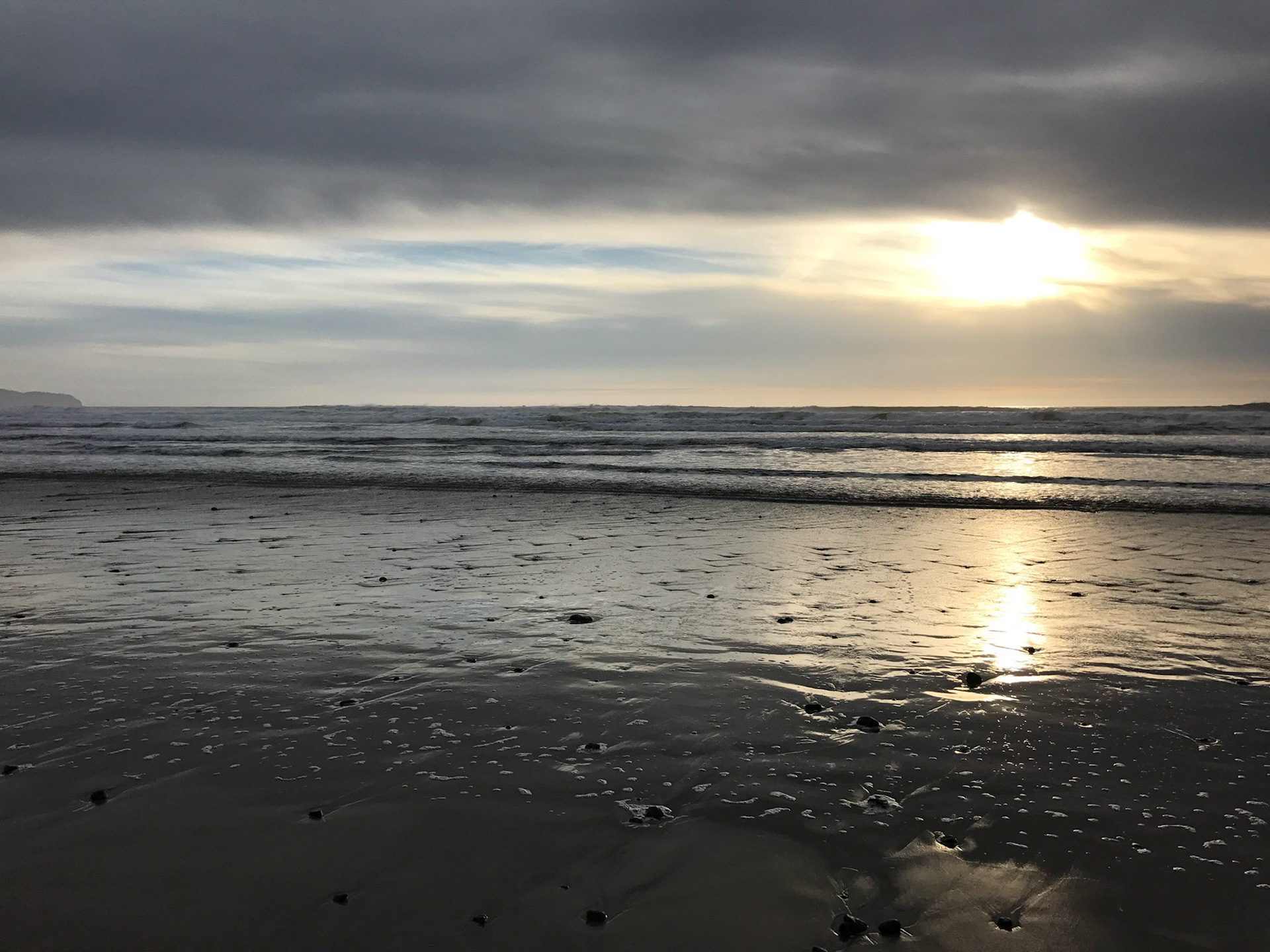
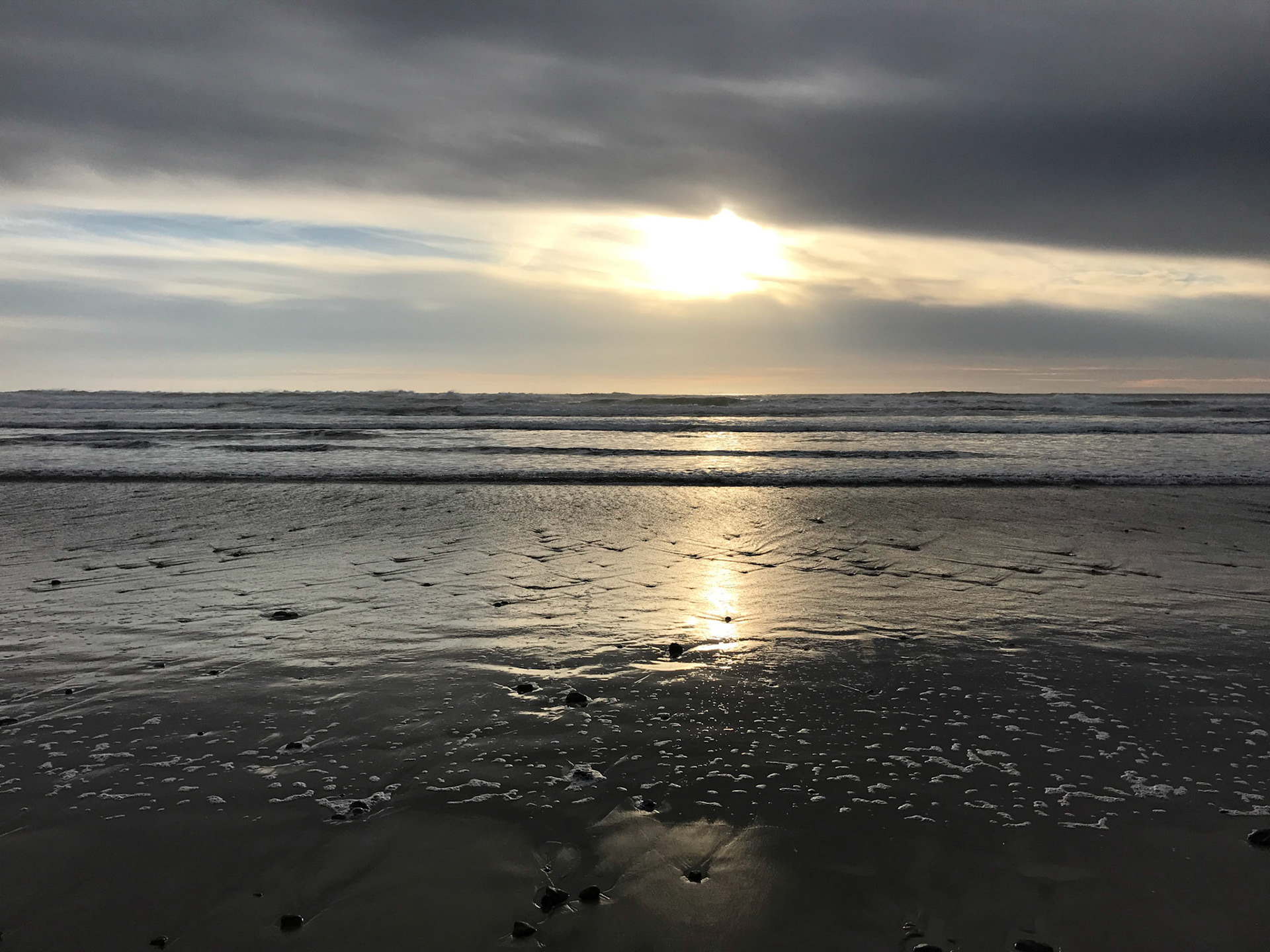
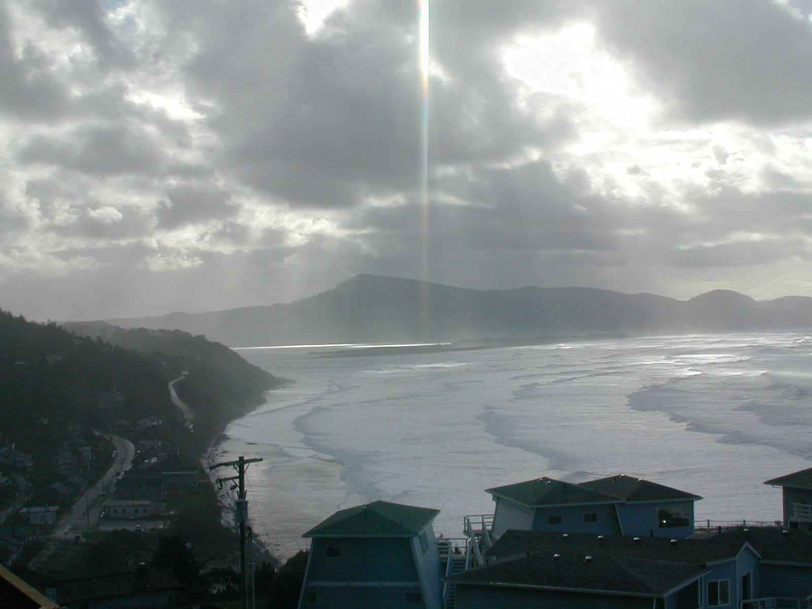
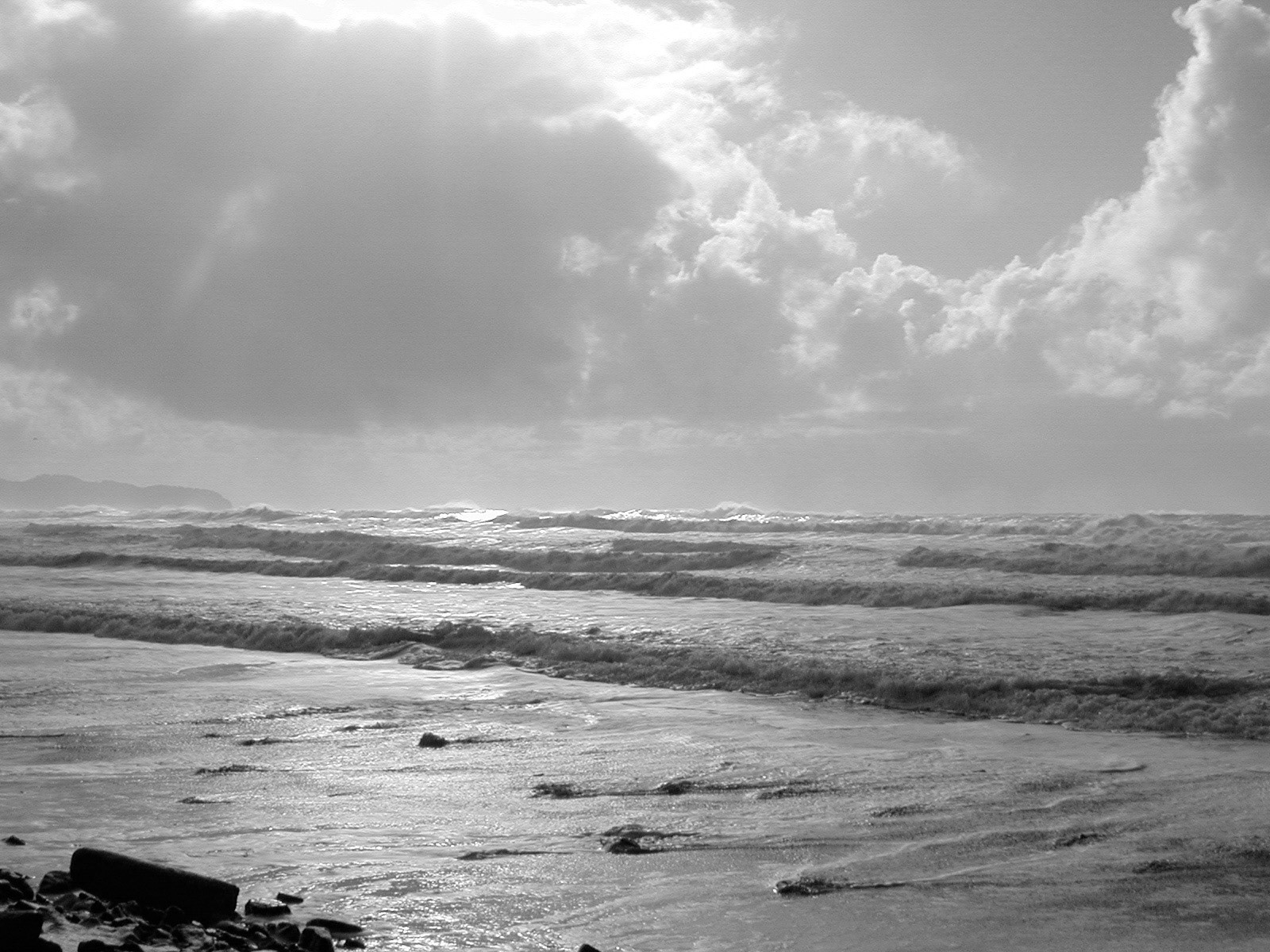
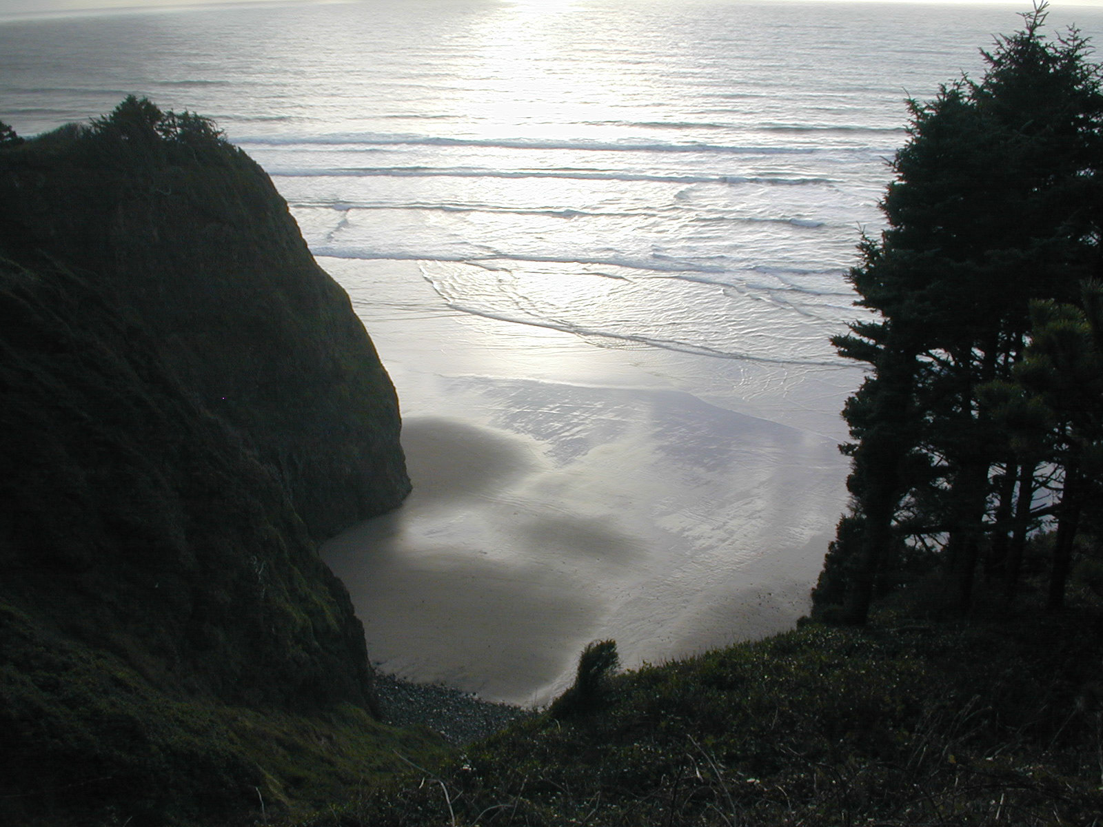
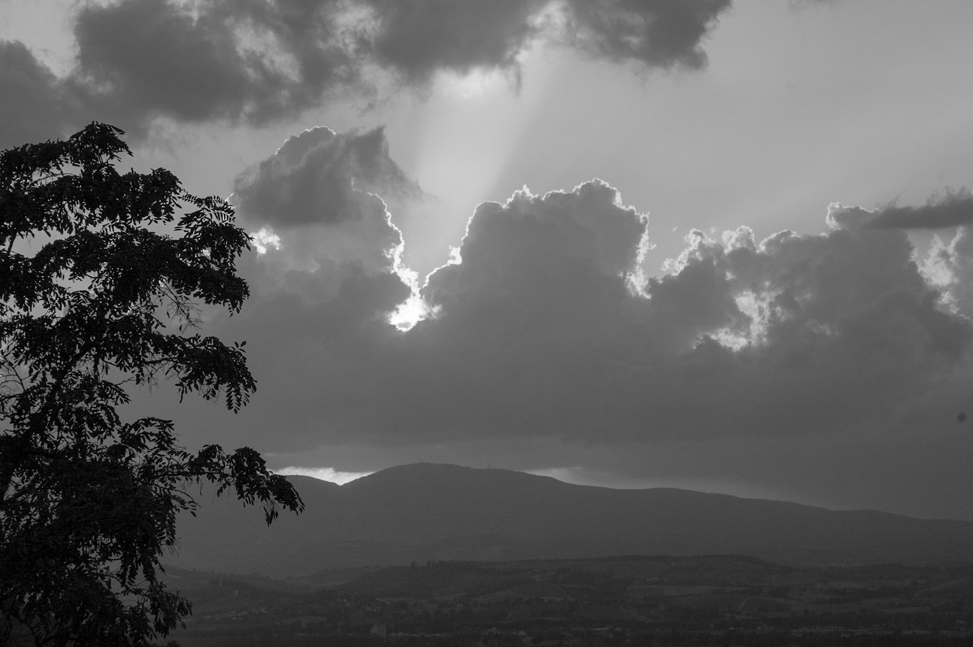
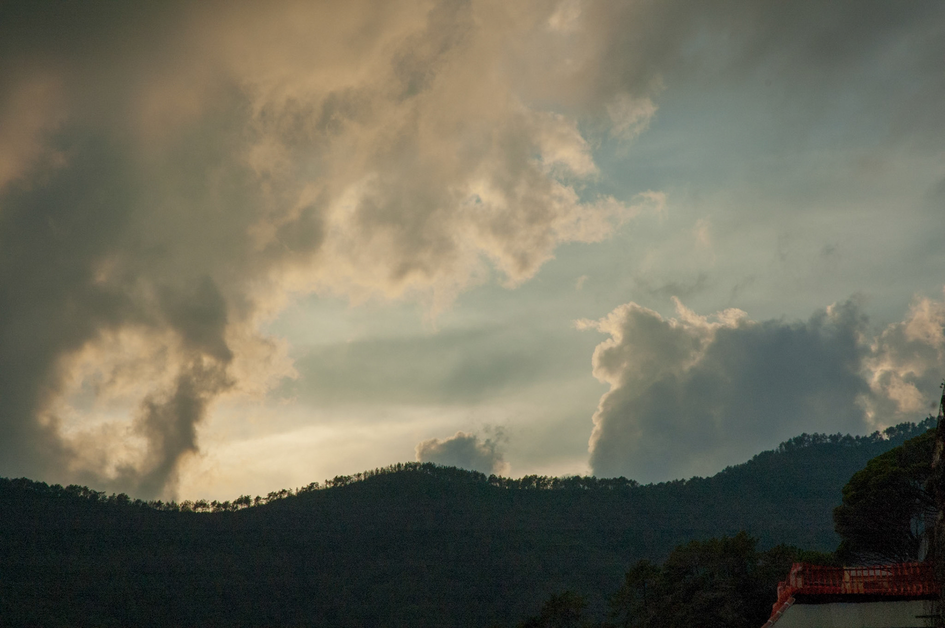
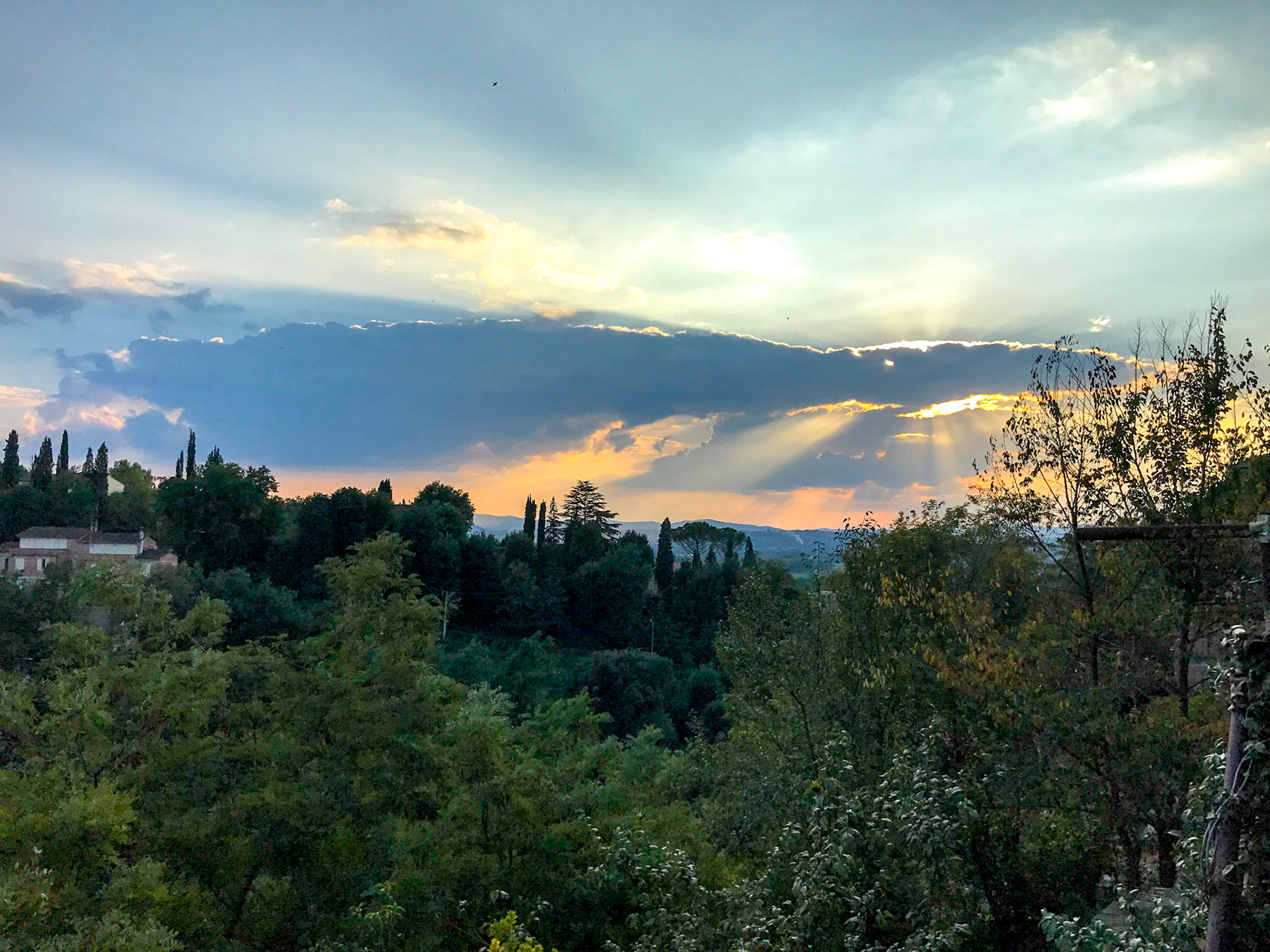
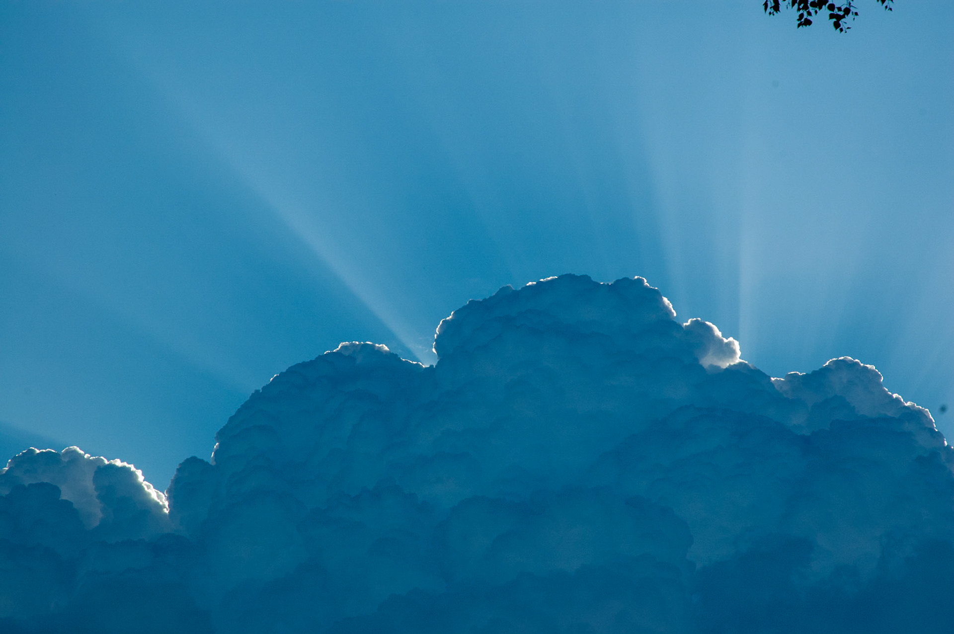
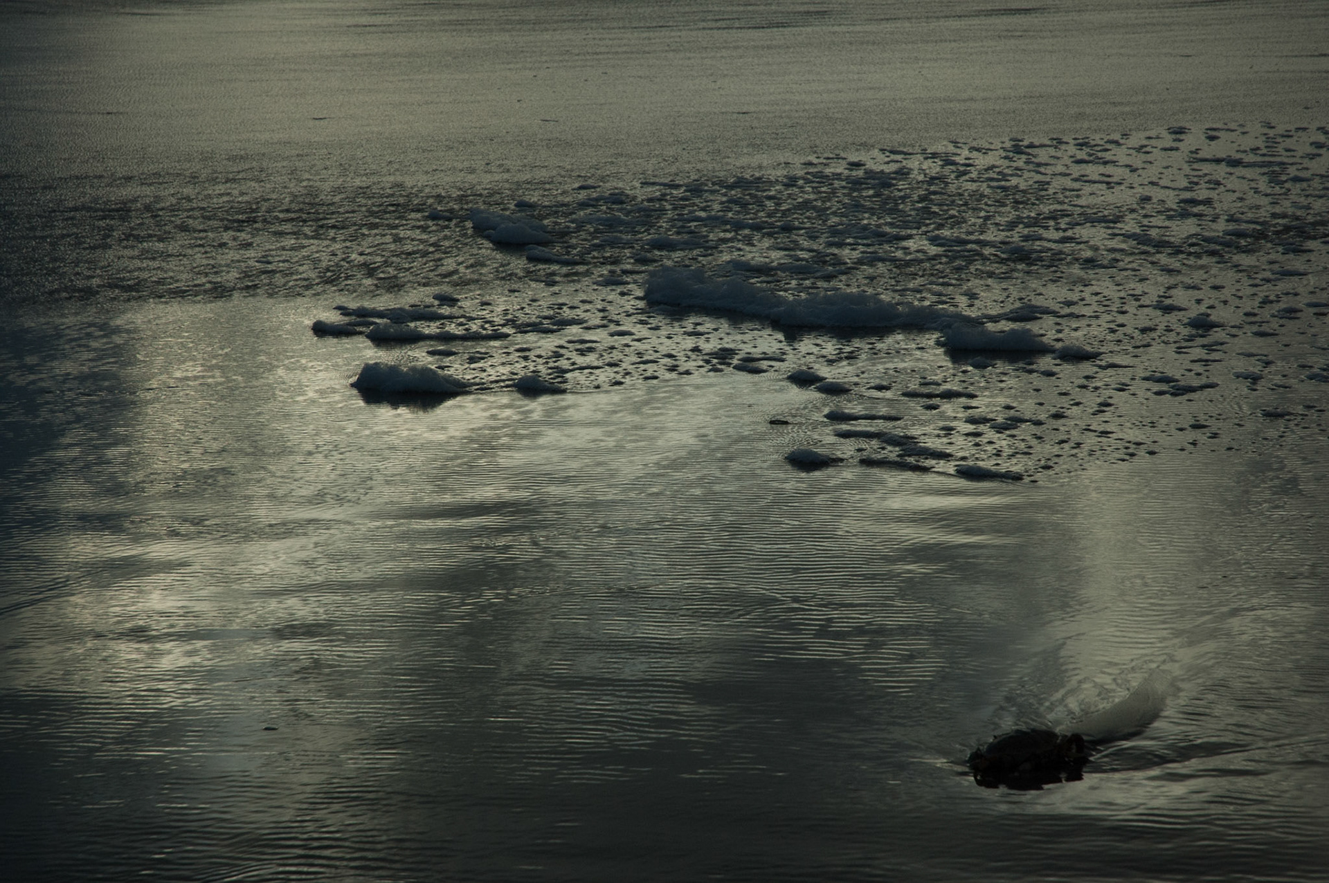
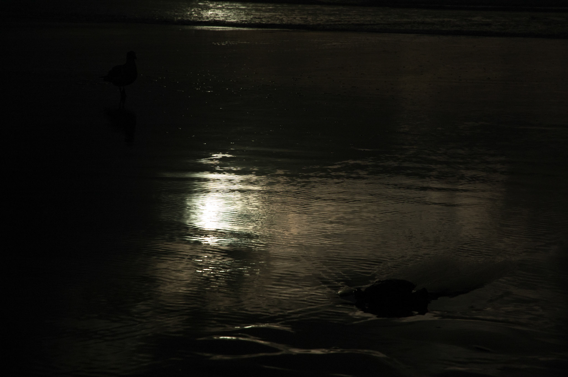
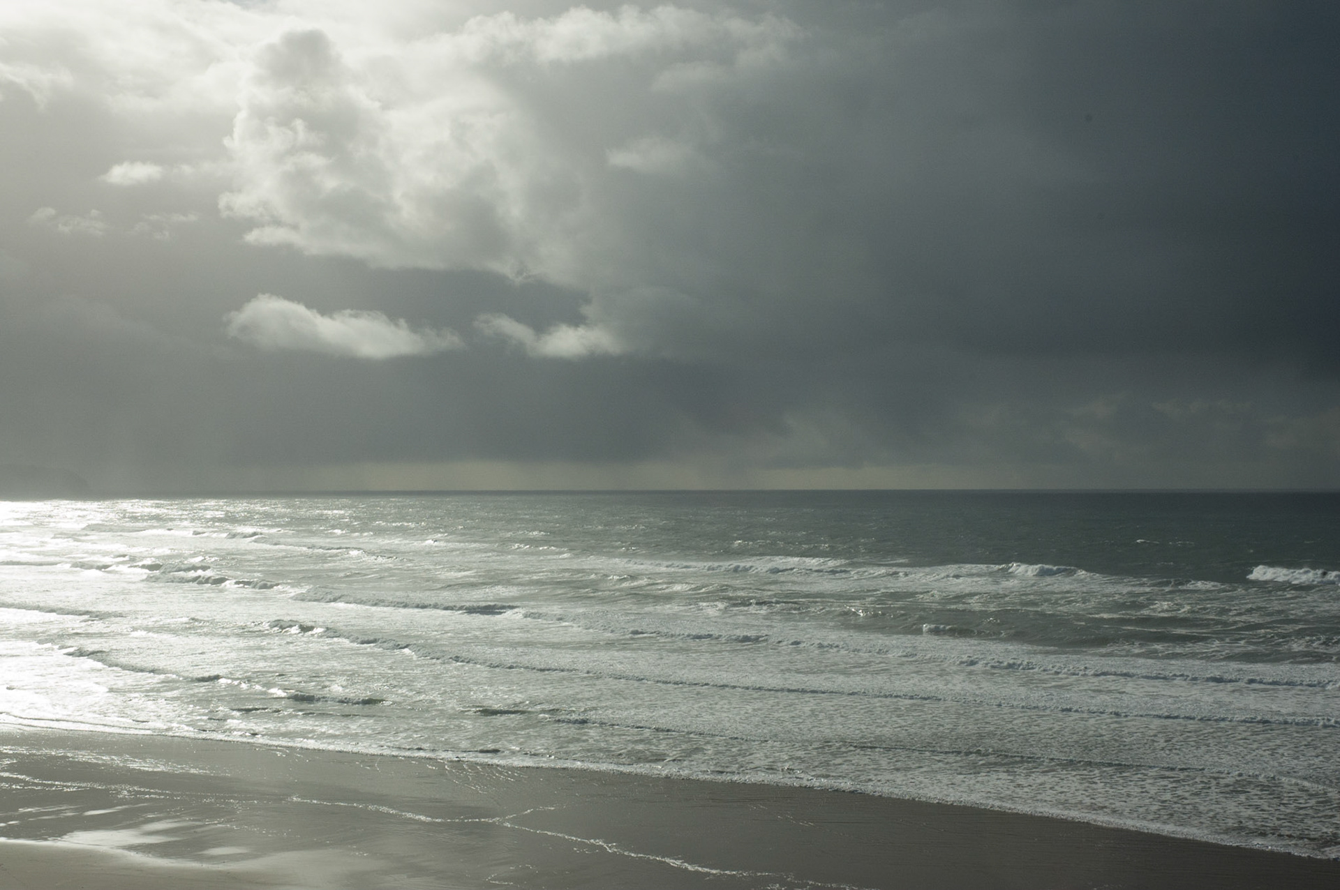
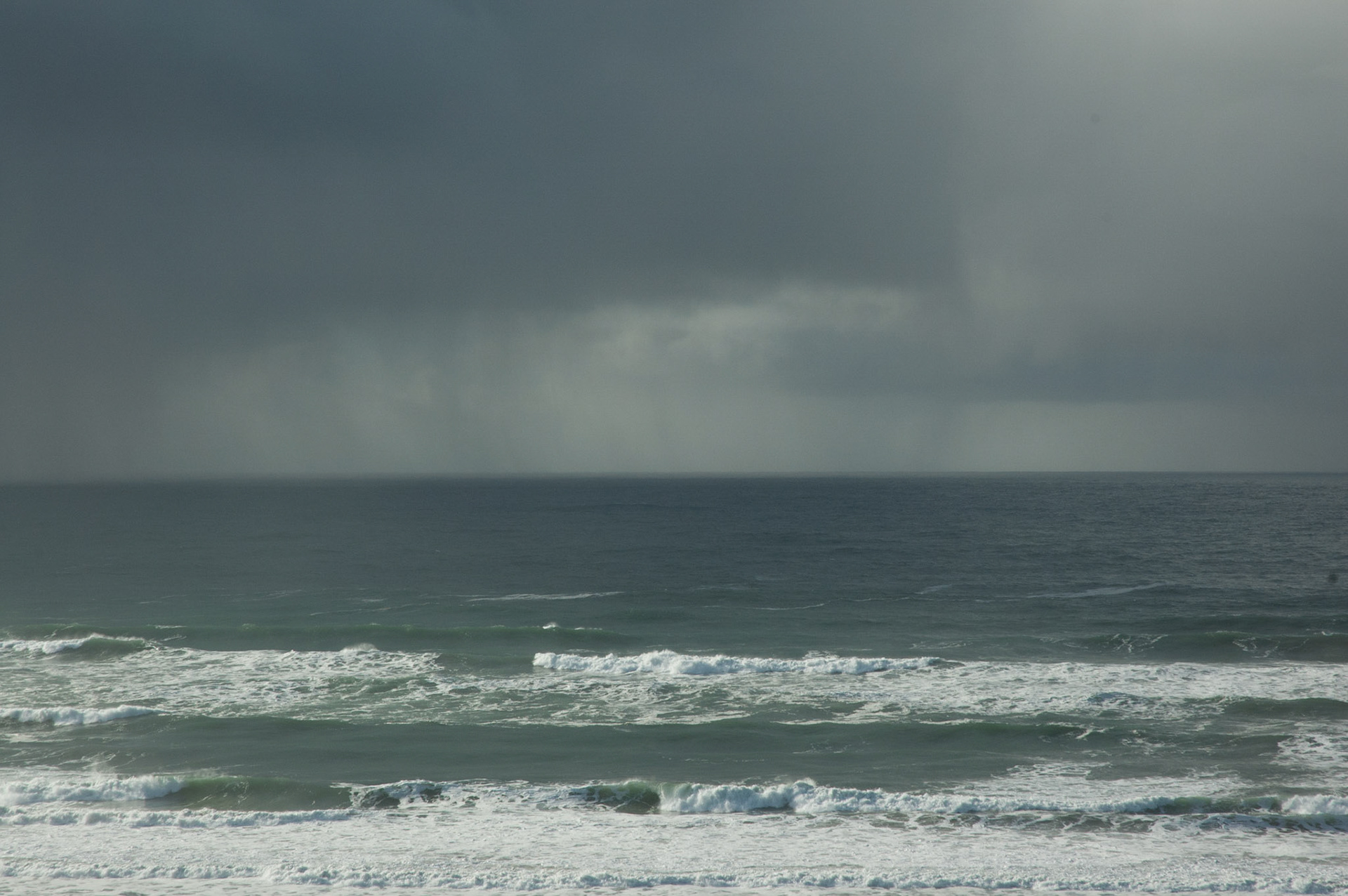
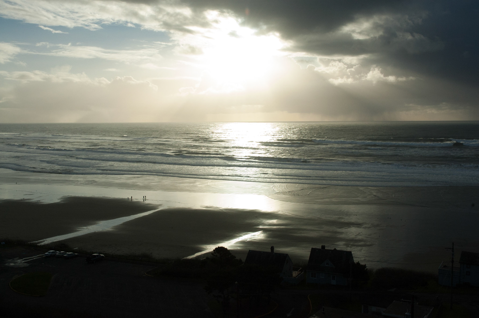
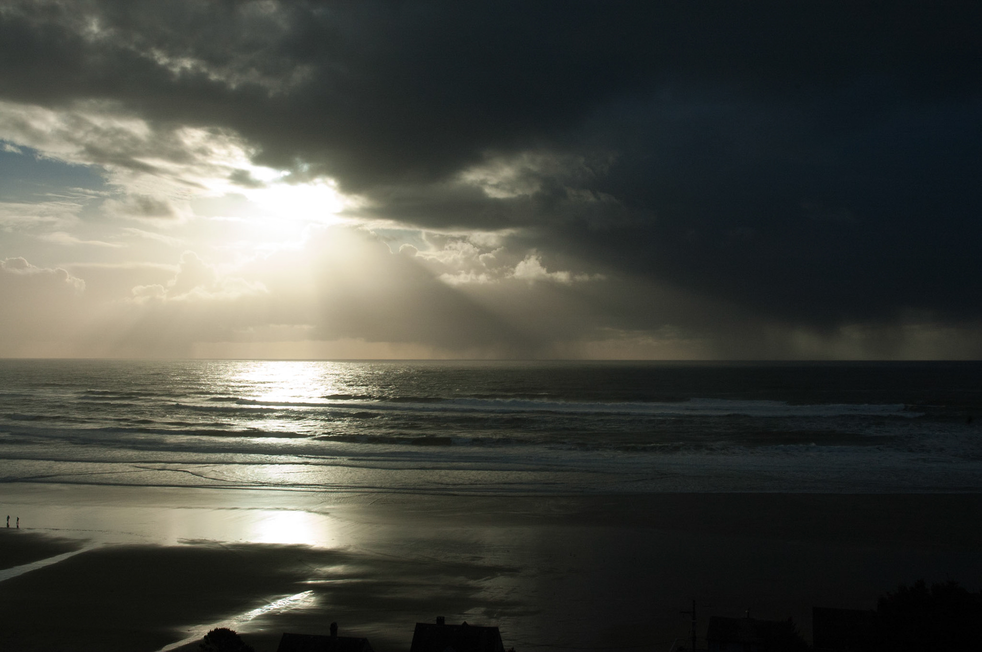
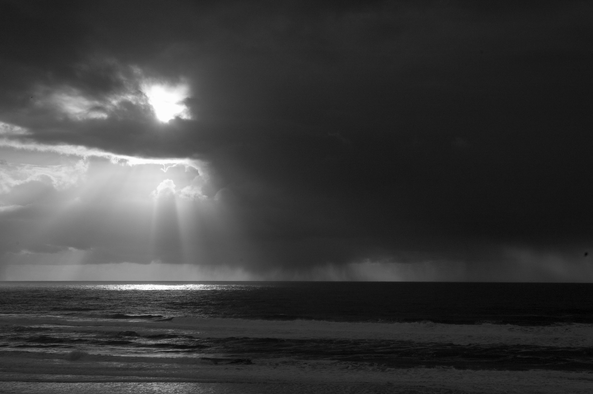
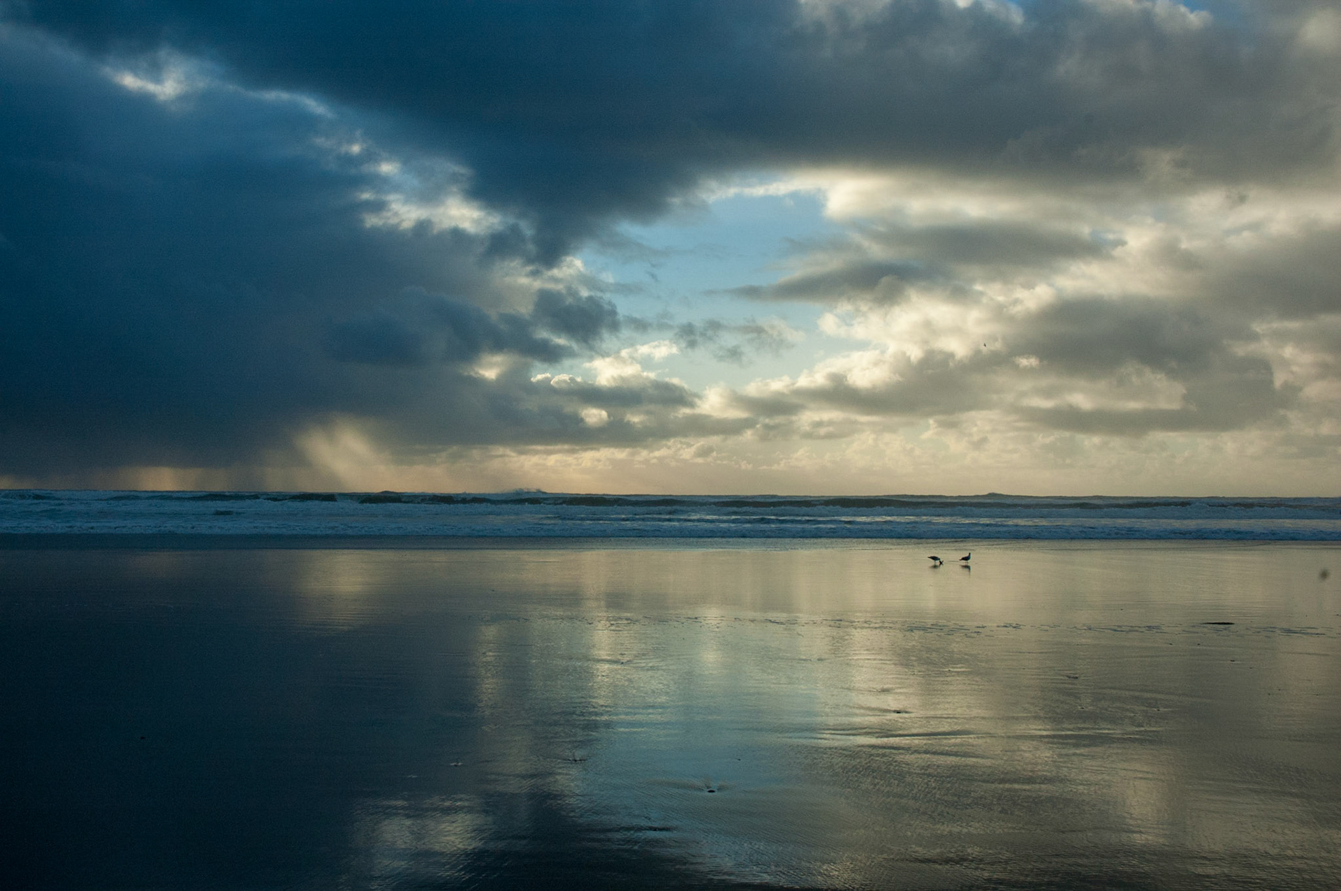
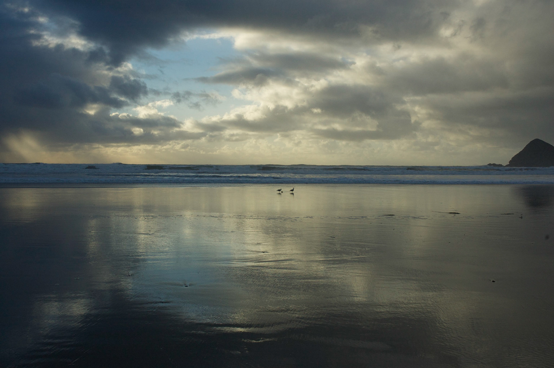
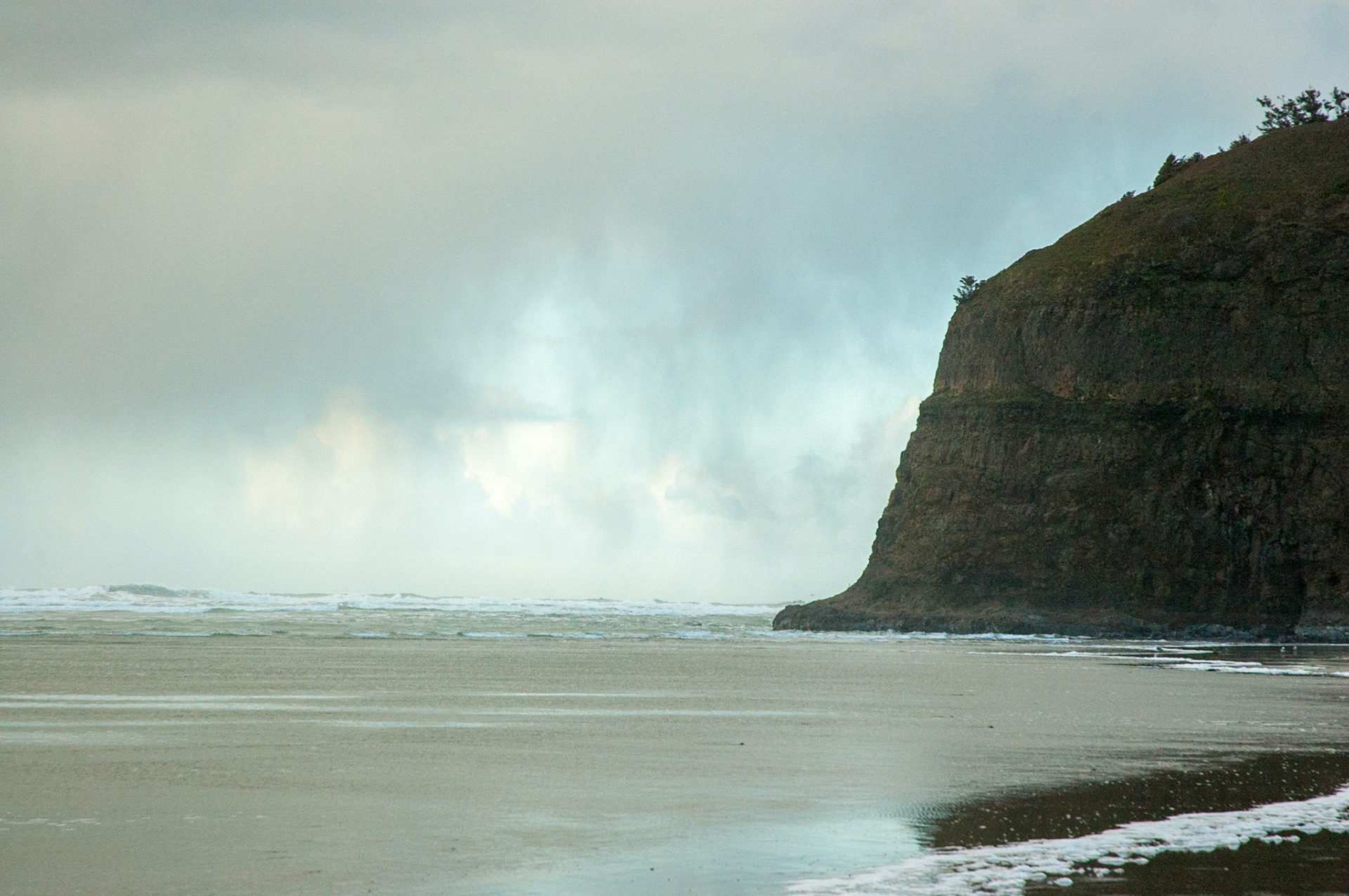
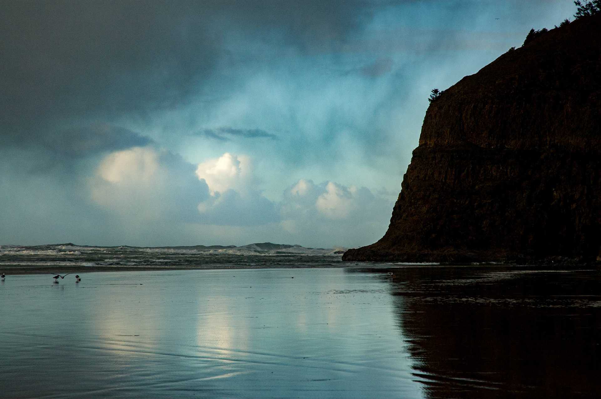
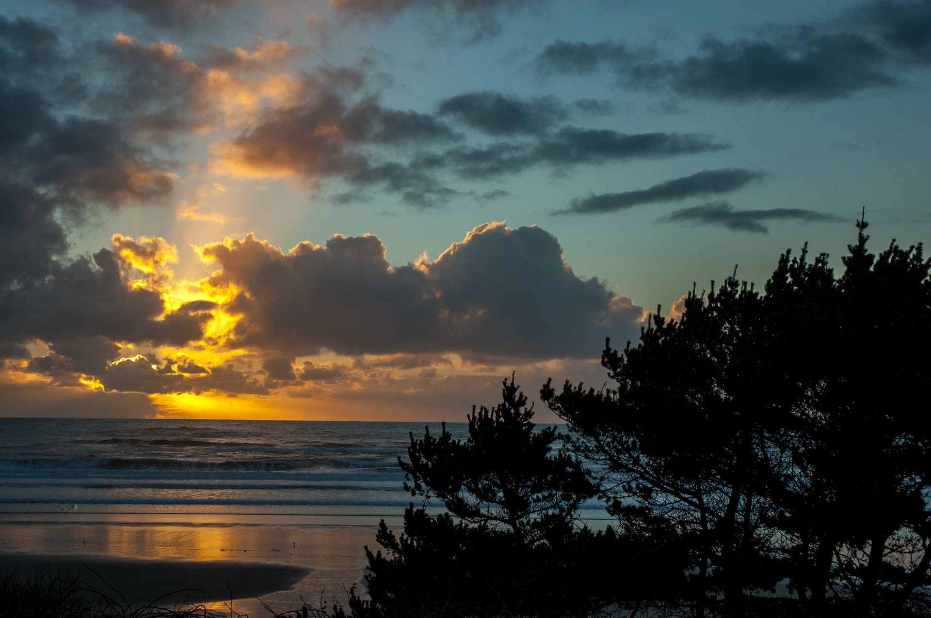
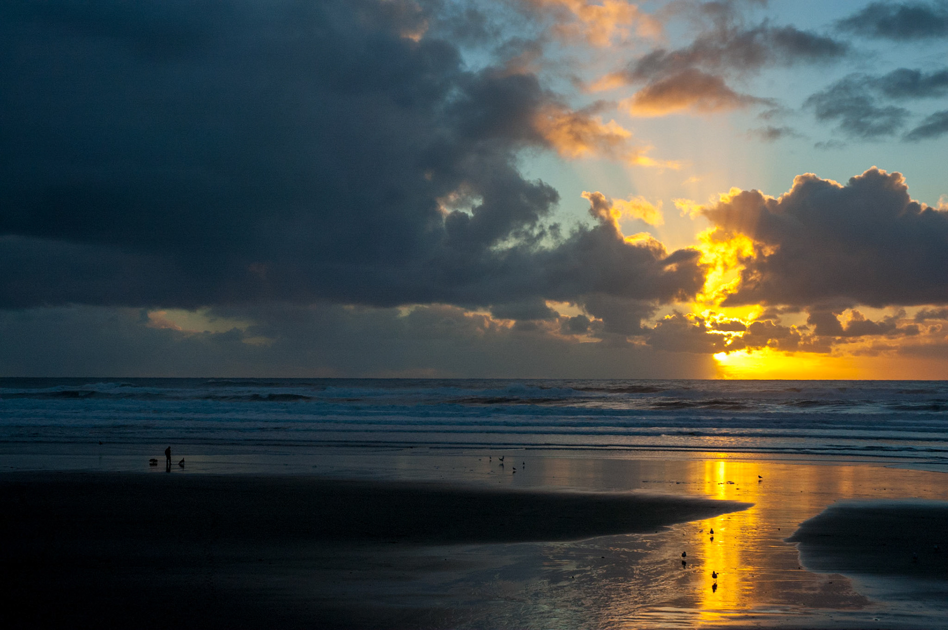
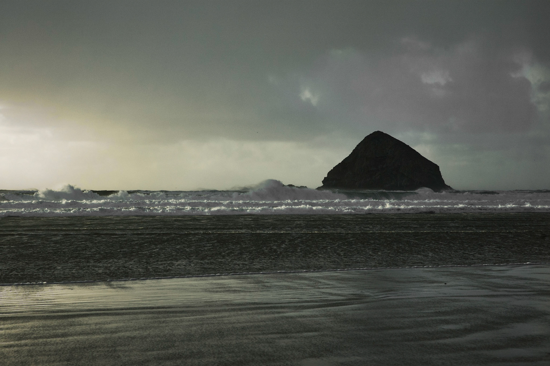
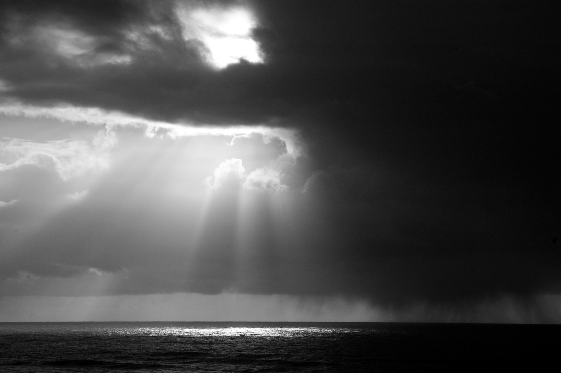
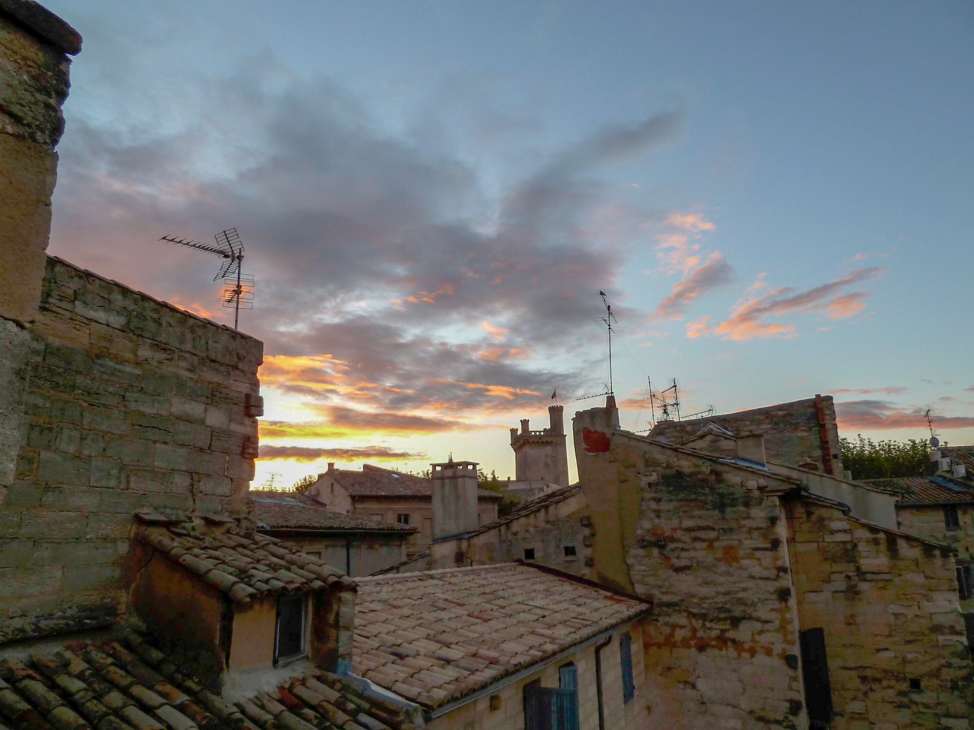
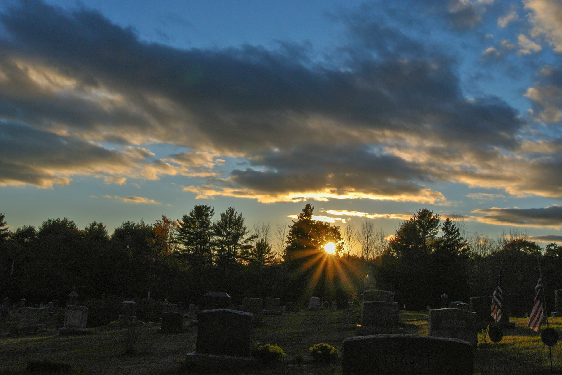
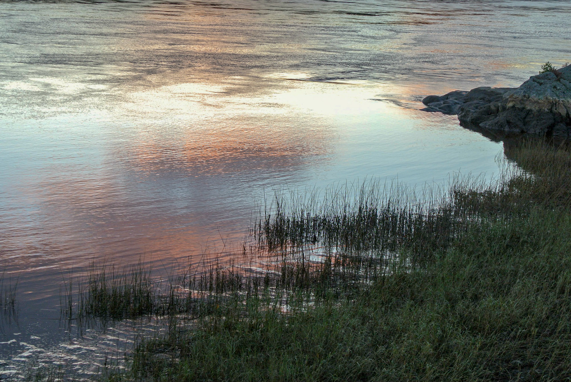
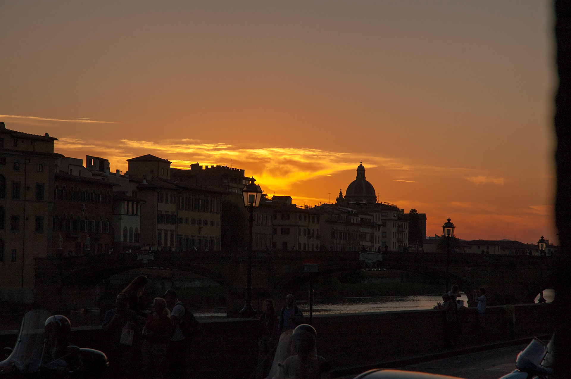
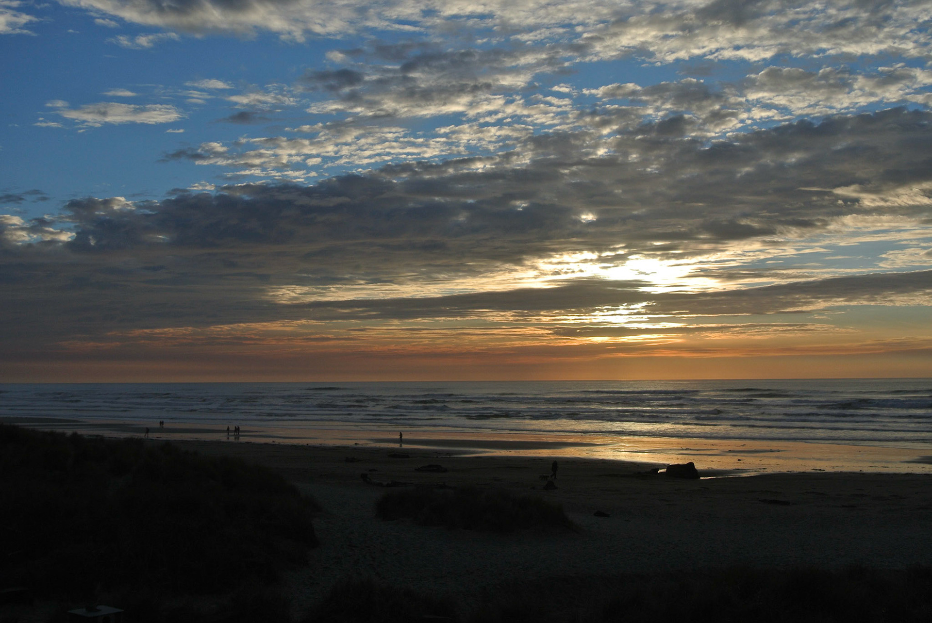
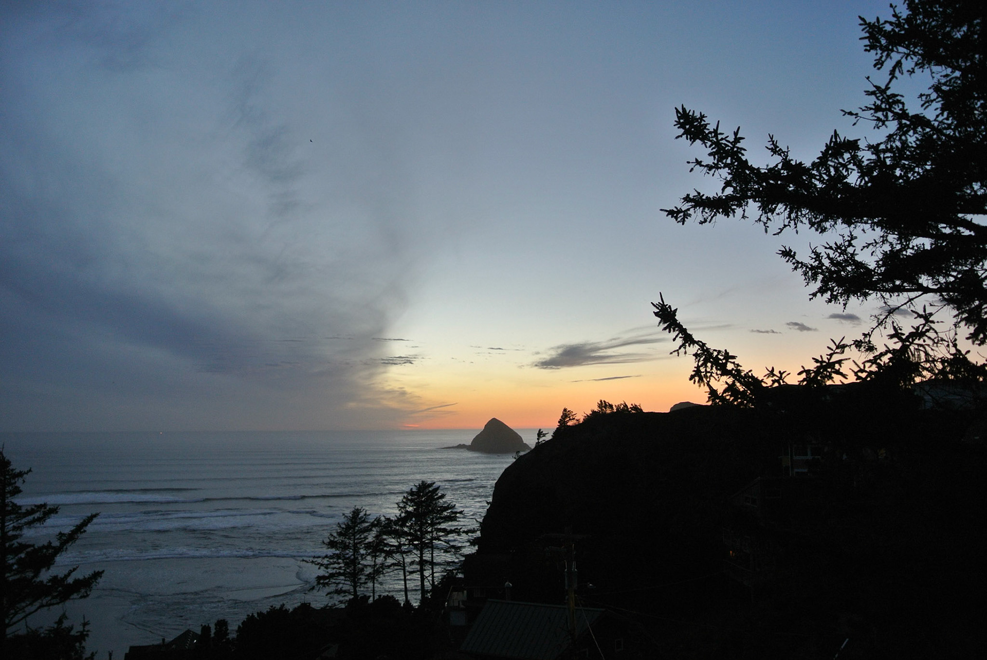
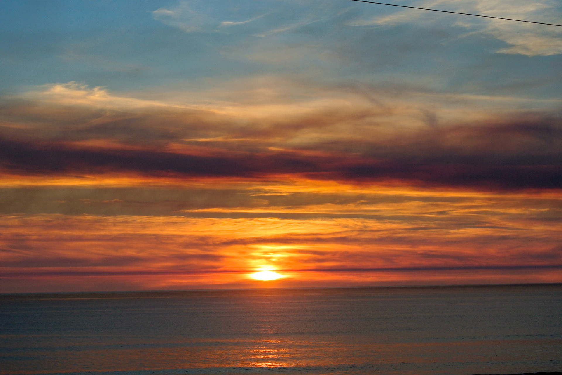
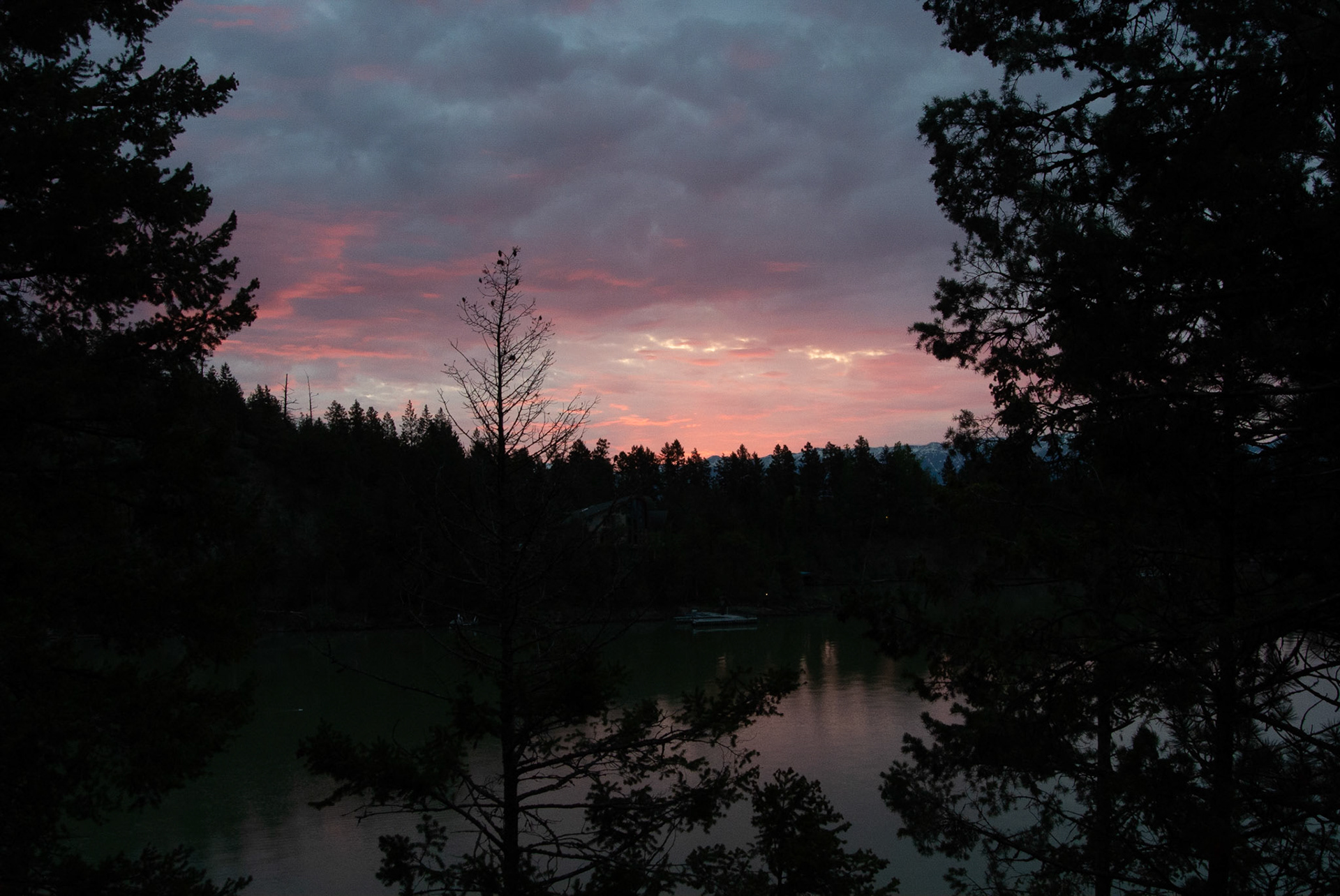
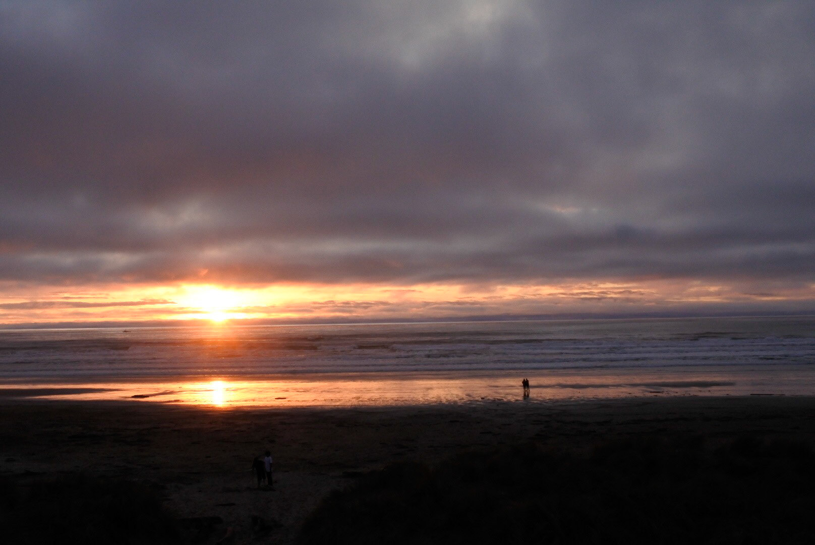
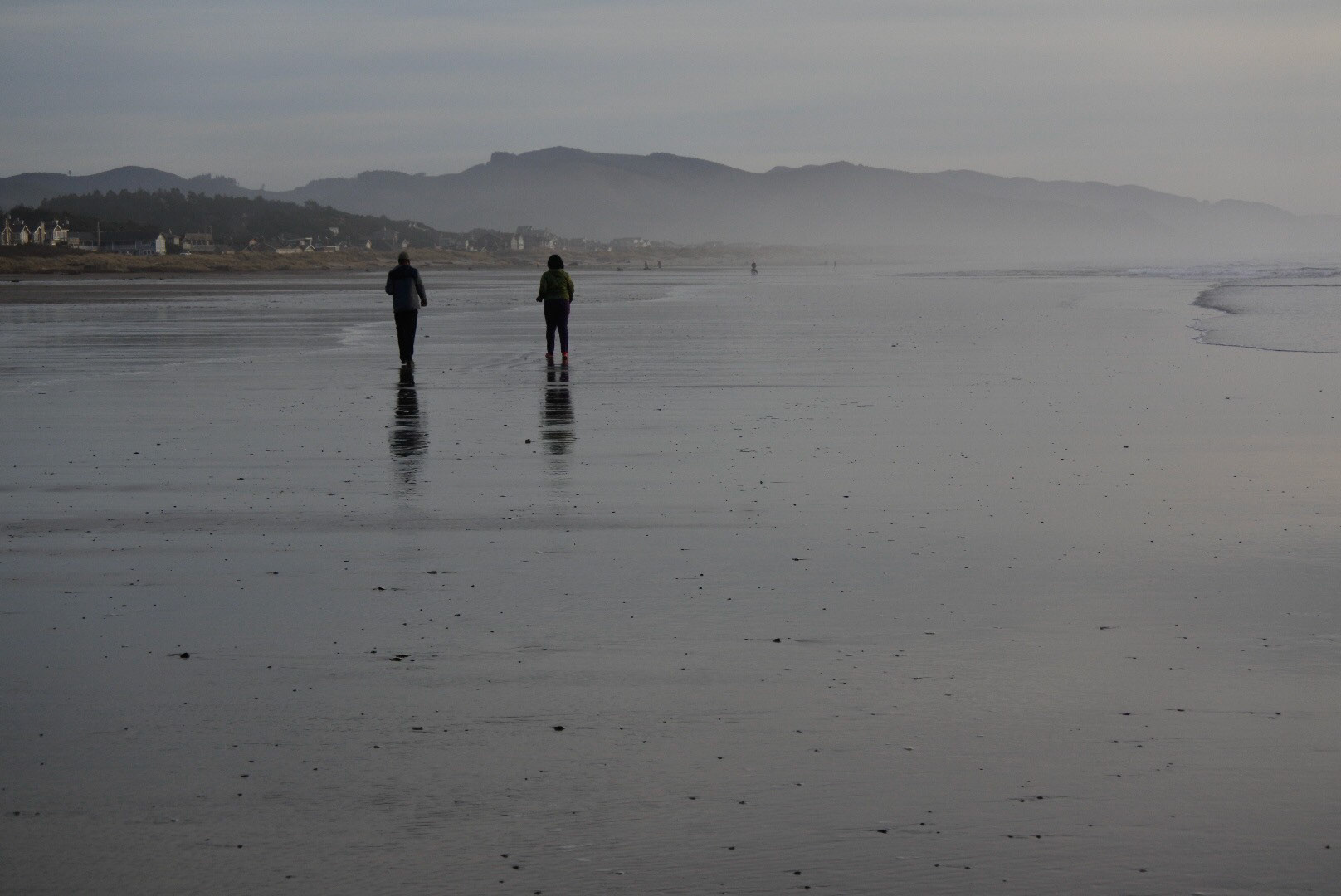
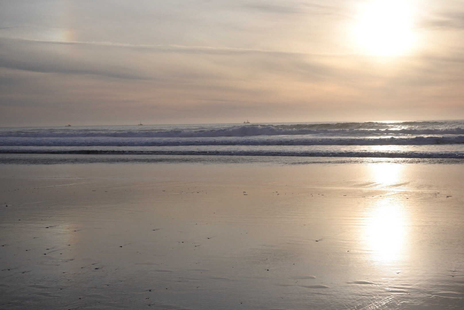
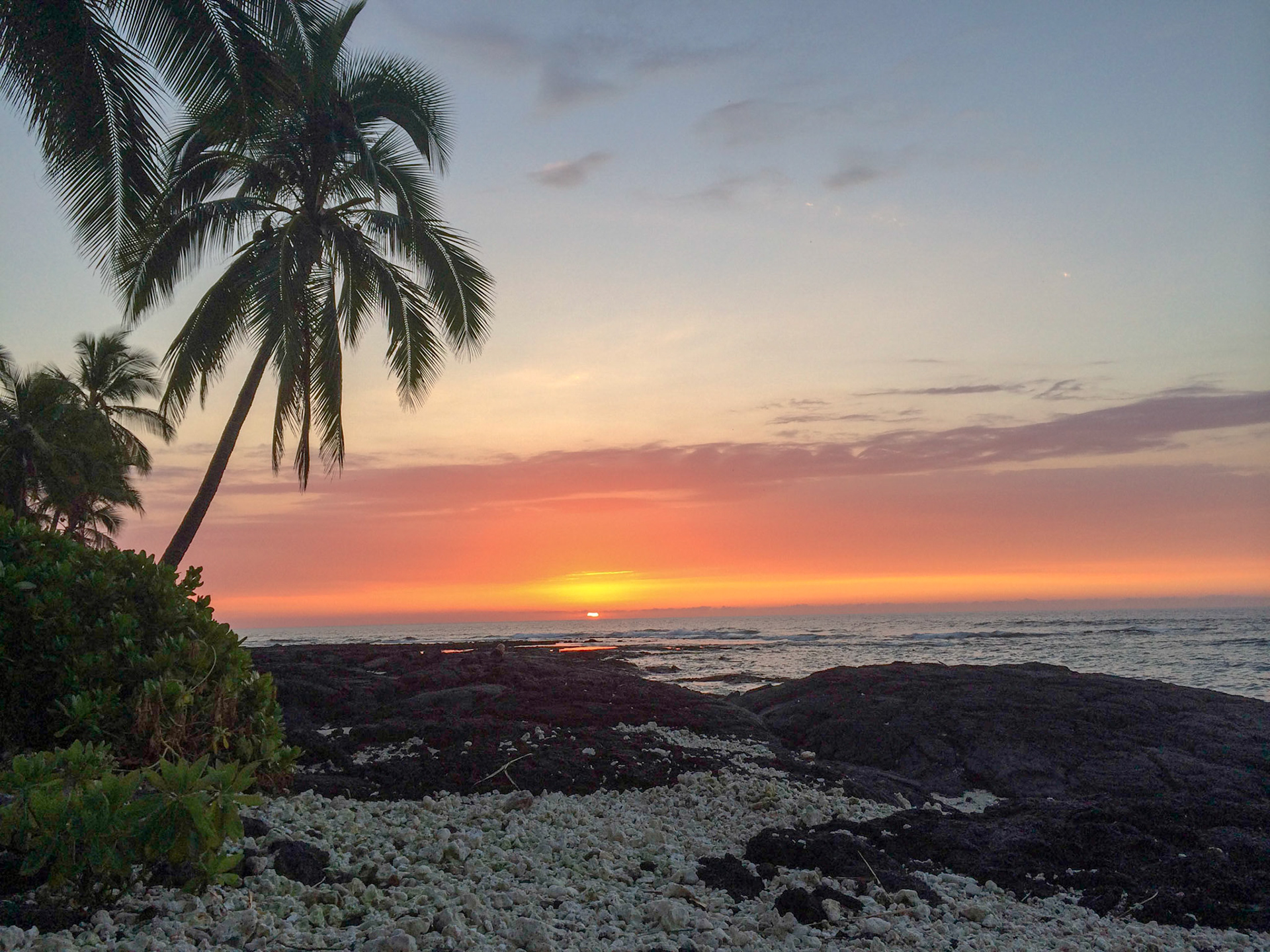
It's a joke between Linny and me that I'm always ready to take one more sunrise, sunset, storm, or natural dynamic. Once in a while, a person winds up in a shot. Sorry about that. This set has quite a few in it, (photos, not people) so please be patient while the download happens. In fact, I'm going to grab a glass of wine.
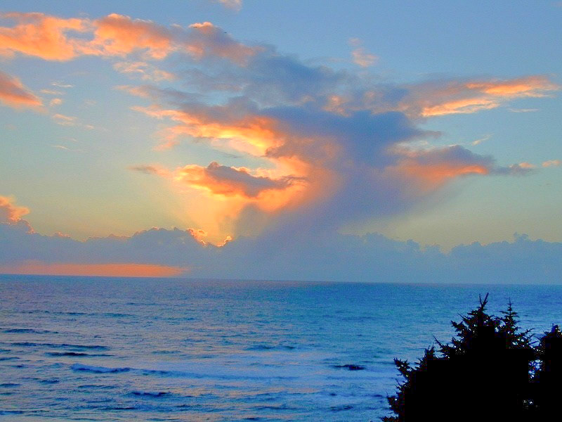
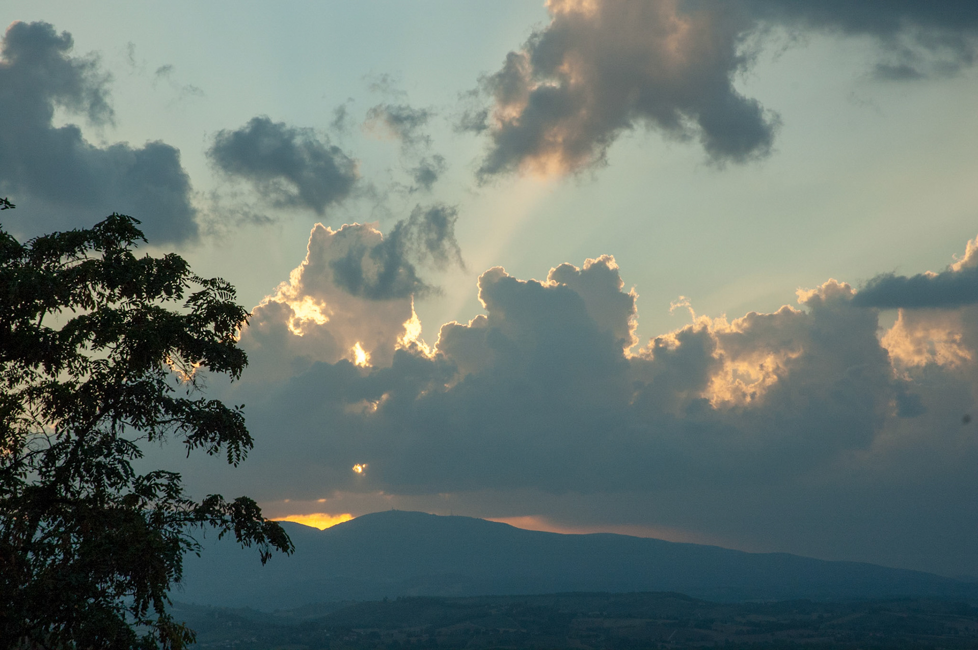
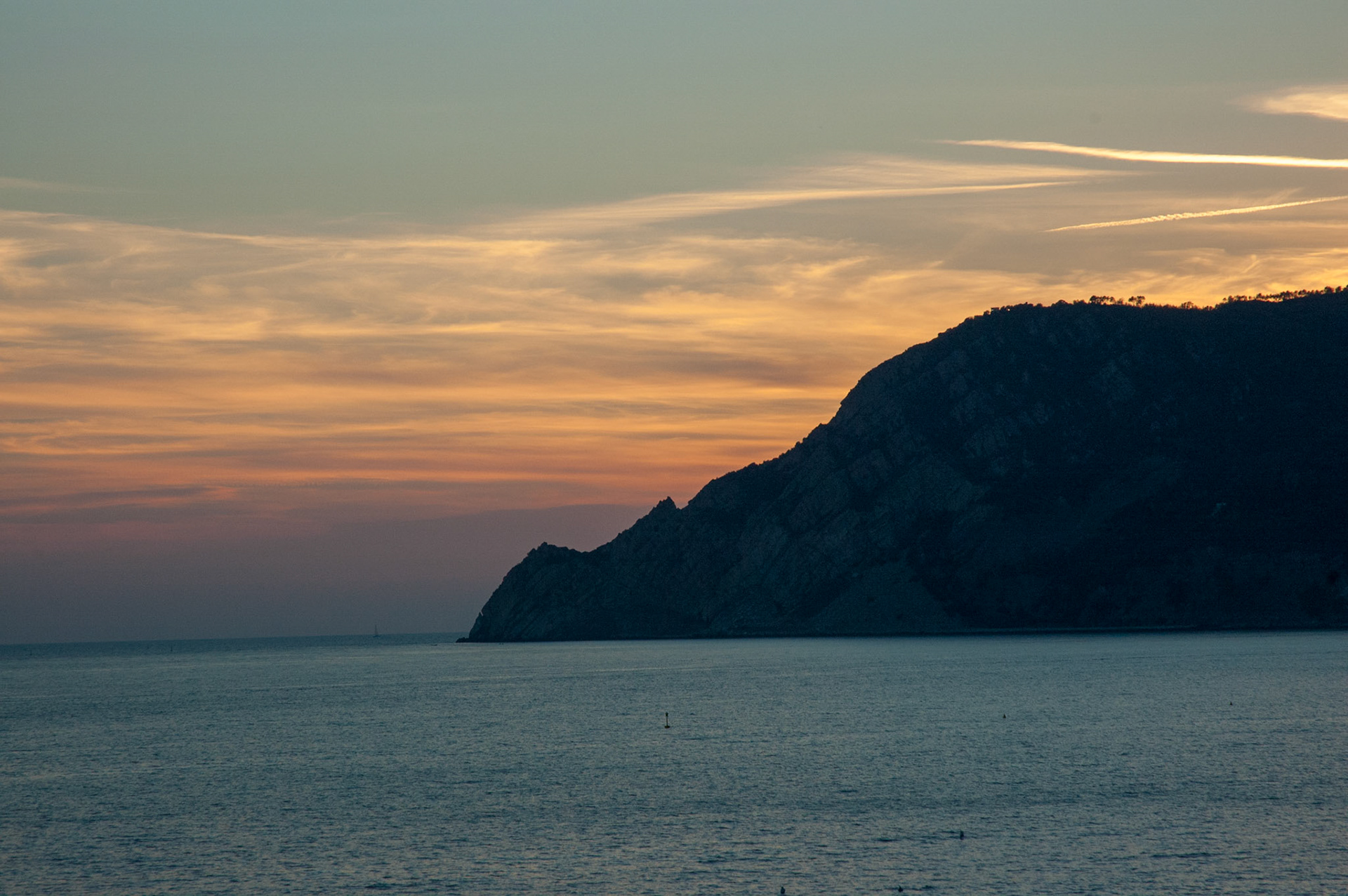
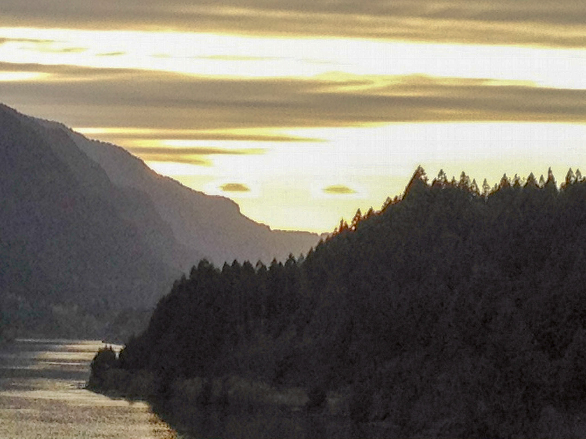
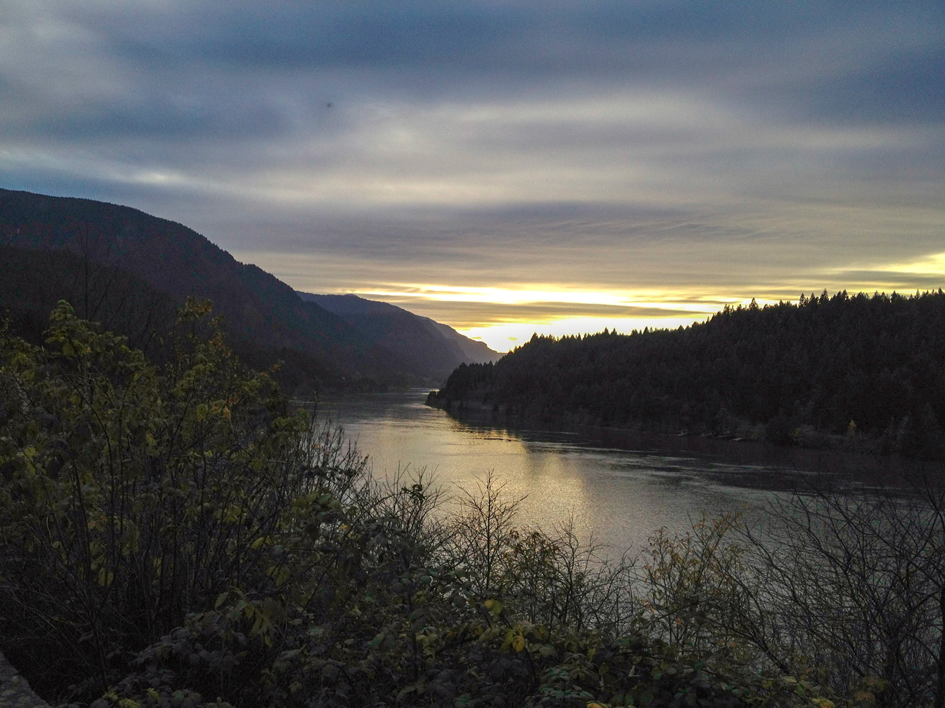
The past few years have witnessed photo-filter madness that jams every color beyond…well…the pale. Those colors occasionally happen in nature and I've been happy to snap away when they're there. I still take my photos to the digital darkroom for whatever art and craft demand/suggest, but I try to avoid fake colors and pretend they're natural. And that topic is worth some discussion.
What is accurate color? My first training was in traditional print, where half-tones allowed approximation of tone and screens of cyan, magenta, yellow, & black (CMYK) had to do their best to trick the eyes of the beholders into seeing a dynamic range of colors. The variables were the color and quality of the paper, the fineness of the screens, the quality/vendor of the inks, the capabilities of the press, and the skills of the press operators and the prepress artists before them. We delivered mostly reflective art. The page.
Now we approximate all colors with red, green, & blue (RGB) in a luminescent delivery. The screen.
With fewer variables, ink on paper became reasonably predictable. The first and last copies of a photo catalog would usually be quite close, though not always. But on the screen, there's color anarchy. Screens are color calibrated after manufacture, by each manufacturer, and that may be the last time, but they change. A lot. And there are huge differences between digital technologies and delivery devices. I color calibrate my monitor about one a month when I'm not working on a color-critical project. When I do that, I might calibrate daily (after the computer warms to a stable temp).